It has taken some time to digest the tour de force that was Calligraphy Northwest, which took place last week at Reed College in Portland, Oregon. It was the 31st of these conferences, but my first foray. The Portland Society for Calligraphy, led by Carol DuBosch and Meri Taylor, did a stellar job of running the event---which had a lot of moving parts and a dream team faculty---without a visible hitch. There are not enough hours in the day to report on the full experience, but a few things float to the surface at the moment.
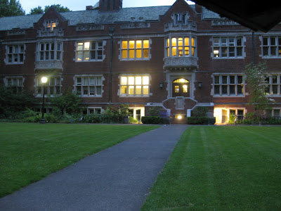
The campus is lush and stunning, and more than a few referred to its vibe as "Hogwartsian".
There was much focus on the life and work of Lloyd Reynolds, initially an English professor at Reed who taught himself Italic from a copy of Johnston's Writing and Illuminating and Lettering, and slipped calligraphy into the curriculum circa 1948, initially as "alphabetic communication"! The class was an enormously popular course (up to 80 in a class!) which he taught until 1970. The movement spread to the Portland schools and contributed a national revival of the art form. Ironically, calligraphy was forced out of the curriculum a few years after Reynolds' death. Nevertheless, his influence is felt on the campus and beyond--there are scribes, type designers, and poets who still speak of him with reverence-- and a quiet "calligraphy initiative"is afoot at Reed today. It was not unusual to see subtle references to Reynolds' legacy about campus, i.e. the attribution for this omnipresent font (one of many designed by his former students).
 |
| Lower right says "Lucida typeface designed by Chuck Bigelow '67" |
There were a number of conference attendees who studied with Reynolds, and he clearly was a dynamic force and a man of strong opinions.

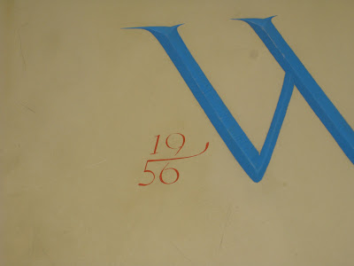
Presumably it was his association with Roman cap scholar Father Edward Catich that resulted in the elegant lettering on the lintels of several buildings, notably Eliot Hall where Reynolds held court in the third floor lecture hall.


Some better shots of his work on the old dorm block:

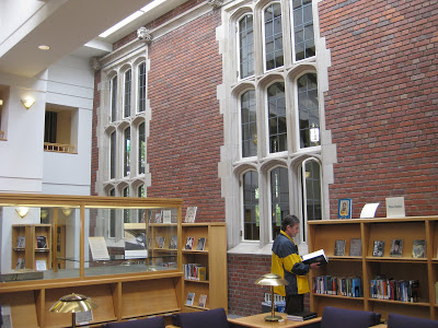
In honor of the conference, there were exhibitions of the work of both men in the college library, a charming meld of old and new buildings.
Some Catich stonework was on loan from the Portland Art Museum, so we got a closer look at the carvings and their preliminary brushwork.
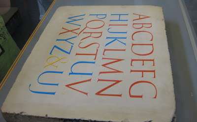 |
| The red letters are Trajan; the blue letters did not exist in the Roman alphabet, and were presumably of Catich's invention. |
 |
| Catich established that the Trajan letterforms were the result of brush or reed work, later carved into the stone. |
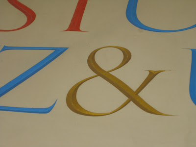
I'm crazy for ampersands, but I have to say, the date on the stone below was my very favorite detail!