 |
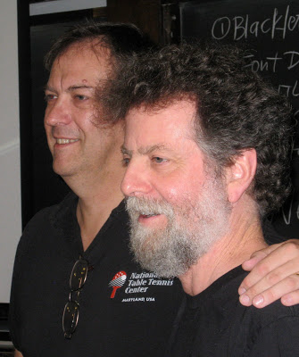
| Julian Waters & Carl Rohrs, June 2012 |
 |
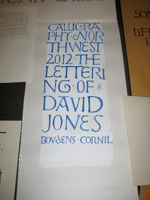
| Eliot Hall, Reed College, Portland OR |
 |
| Workbooks by Carl Rohrs (top) & Julian Waters (bottom) for CNW |
 |
| Julian demos while Carl comments |
 |
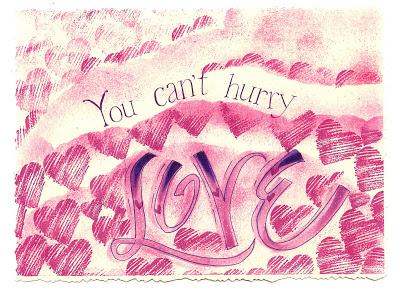
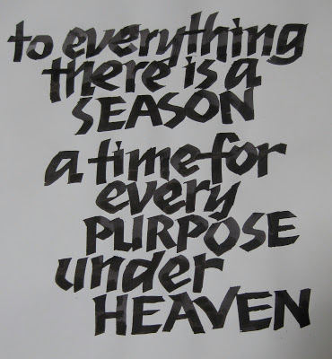
| Contrast! |
 |
| It's all in the details! |
This wasn't a product-oriented class, but a rather stream-of-consciousness romp through big ideas and tiny details--which seem now either too vast or too small to write about here. In what they had predicted would be a "somewhat improvisatory" presentation, it was fascinating to listen to Carl & Julian's banter, filled with seriously encyclopedic knowledge of fonts and all things calligraphic. For example, did you know that Rudolf Koch had designed minuscules for his1920s Neuland typeface, but they were abandoned? Here's my attempt at approximation:
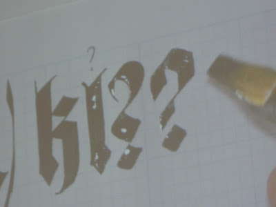
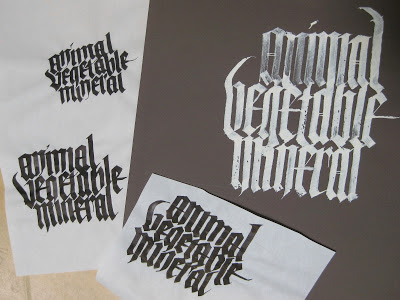
We worked with broad nib, automatic pen, folded nib, ruling pen, flat brush and pointed brush. Here we were trying to eliminate as much negative space as possible in our blackletter:


That afternoon we switched to pointed brush and my head almost exploded! I won't trouble you with illustrations of my feeble attempts.
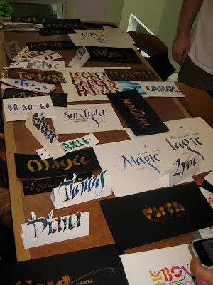
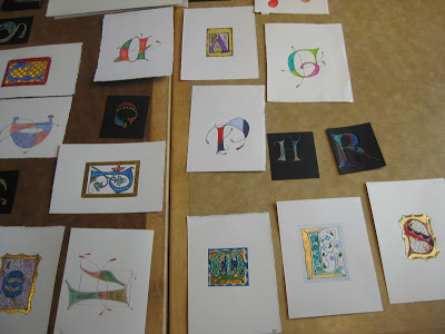
At the end of the week there was a "show and share" in the dining hall. What a feast!
I apologize for the lack of attribution--way too many to keep track of.
It was announced that in addition to the 2013 conference at Colorado College next summer, the 2015 conference will take place in the Bay Area! Save the dates!