It's a Wrap


Cavallini & Co. images
Perhaps, like me, you are a fan of Cavallini & Co.'s vintage image calendars. And if so, perhaps, also like me, you cannot bear to throw them away. So there they sit in the studio, more years' worth than I care to count, trimmed and neatly stacked...

Enter four certificates created for much-appreciated volunteers at my school (sorry, can't reveal them here in the unlikely event the recipients follow my blog). I always hesitate to frame things for other people, not wanting to assume that the piece will live on display rather than tucked in a safe place and taken out occasionally to enjoy. But how to present in a decorative fashion?

Inspiration, fortunately, struck: I took a calendar page, cut a piece of vintage Fabriano colored paper the same size and lay it in as a liner (Canson Mi-Teintes would work well, too), set the certificate in the middle and folded the calendar and the liner squarely. A strip of the same paper was used to made the band, and fastened with fragrant Atelier Gargoyle sealing wax. (I'm a little out of practice with the creme brûlée torch, but it got the job done.)
Cavallini & Co. images

Cavallini & Co. images
Forgot to photograph the backs, but the calendar grid itself is visible, and a little more of the image.

This isn't the first time I've upcycled these gorgeous images; here's a link to my post on some more complex stationery portfolios. Enjoy!

Bye Bye Blackletter

The names of everyone who has ever attended a Black Sabbath class
by Ward Dunham
It was a bittersweet event.  On Saturday, December 4, students and friends of Ward Dunham & Linnea Lundquist gathered to celebrate the end of four-and-a-half years of "Black Sabbath" blackletter classes in their San Francisco studio, Atelier Gargoyle.  Those of us lucky enough to attend these monthly Saturday sessions were expertly and enthusiastically schooled in Textura, Johnstonian Italic, Uncial, Batarde, and other related topics by two exceptional calligraphers who happen to be a couple and, often, a comedy duo.


There was food, including cupcakes from the wonderful Jasmine Rae Bakery, who have kept us in yummy gingerbread and other delectables these last few years.


Look closely...those are fondant Brause pen nibs!  Good enough to eat, and we did.


Ward tended bar, offering his signature Hot Apple Pie adult beverage...


...while Linnea helped everyone stock up on supplies from the shop.


The exhibit of the students' final projects, beautifully displayed on the studio walls and tables, was varied and awe-inspiring!


Here is a closer look at a few of the pieces for which the photos came out reasonably well.  There were so many wonderful ones!

Meredith Jane Klein
Paul Costanzo


David Brookes

Patricia Coltrin

Jessie Evans
Helen Fung 
Bonnie Noehr
Dean Robino
Raoul Martinez
There were awards, speeches, and heartfelt tributes, followed by lively conversation and merrymaking!


Ward made sure we all had the contact information for their new abode in Half Moon Bay...


...and Linnea, along with the rest of us, shed a few tears.


But it has been a great run, and all of us who participated are richer for it.  Black Sabbath has been an important part of the San Francisco calligraphy community, and will be sorely missed.  Thank you, Ward & Linnea!  It has been a pleasure and a privilege.

Grace Under Pressure

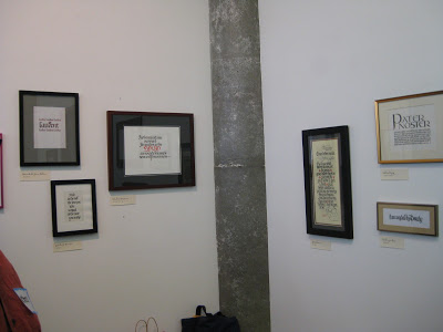
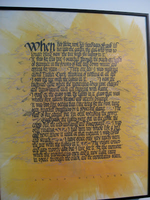
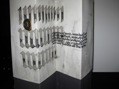
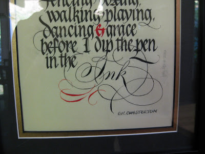
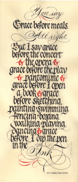
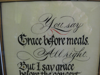
"Grace", original size approximately  8" X 18"
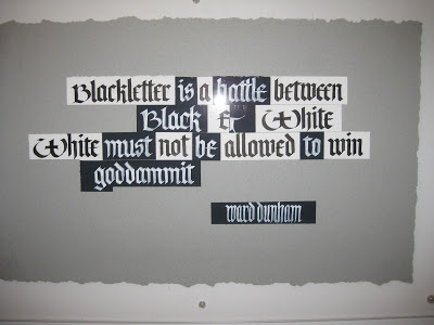
What is it about a looming deadline that brings clarity to our thinking?  This is a piece I had been mulling over for at least a year, occasionally pulling out the quotation and fooling around with it.  Then Linnea Lundquist & Ward Dunham announced they would be closing their wonderful studio, Atelier Gargoyle, on December 4th with an all-day party and show of their students' work.  This was the incentive I needed, and I knew it had to get done and delivered this week since I would be out of town most of the two weeks before the celebration.


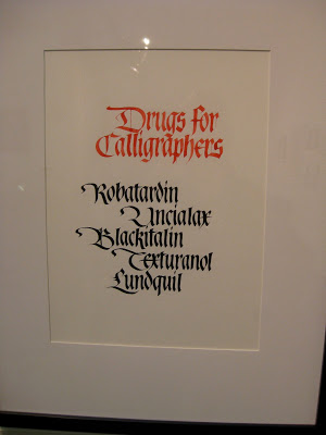
It truly has been a gift to have access to Ward & Linnea's wisdom and expertise these last four-and-a-half years at their monthly Saturday "Black Sabbath" classes in San Francisco where we explored Textura, Batarde, Uncial, Johnstonian Italic (aka Pointed Gothic)--in short, all things Blackletter.  Very early on, after Ward made some jokingly snide remarks about Pointed Pen People, I sent them a New Years card I had designed in Spencerian, knowing that I was "outing" myself as a PPP.  They both responded with one of their famous postcards, enthusiastically encouraging me to work with the two styles "for ultimate contrast", and encouraging me to "look to your Bickham".  "Be the one," wrote Linnea, "to combine the two with panache."  I've never forgotten that, and have always been grateful.


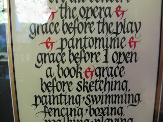
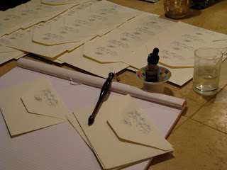
At every Black Sabbath class we painstakingly ground our black Chinese stick ink, and occasionally used Chinese vermillion for electric red accents.  With this piece I wanted to stay faithful to that.  I had originally planned to illuminate the "G" but in looking at my roughs, Linnea encouraged me to keep it simpler.  The diamonds on the G and B are gilded.

When Sheila Waters was in town earlier in the year, she had shown us her latest work on Pergamanata paper, singing its praises and vellum-like qualities, in particular the easy correctability.  I decided then and there it must be the paper for me, and although it took some getting used to, I am now a devoted fan.  It is not at all as mottled looking as in the scan above, and it seemed able to take endless scraping and erasures without complaint.


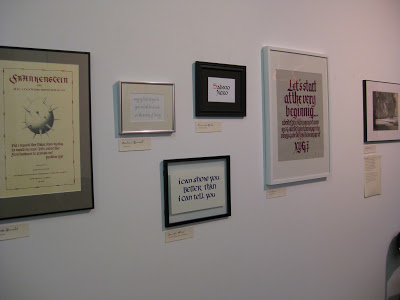
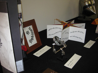
As I said, there was a deadline involved and with understanding friends and a supportive spouse, I holed up in the studio for days, finally coming through with a piece I could live with, then cutting mats for it and popping it into a frame for the show.  I'm looking forward to seeing my classmates' work and getting together one last time;  we've all come a long way in 4+ years and there is some amazing and varied talent in the group.  It's been a great run and I'm very sad it's over.

Walnut-Covered Chocolate

This was a homework piece for Ward Dunham & Linnea Lundquist's monthly "Black Sabbath" class at their wonderful studio, Atelier Gargoyle. The assignment was to write one word all in Gothic caps--something you'd probably never want to do in the real world. It was an exercise in spacing, and legibility be damned! Considering my choice of word, walnut ink was the obvious medium.

This Year's Runner-Up


Though I seem to be in a New Year's card groove, I've always loved this snippet of lyrics from "God Rest Ye Merry Gentlemen"--such a simple and universal wish. So when the November assignment at Ward Dunham & Linnea Lundquist's monthly Black Sabbath blackletter class at Atelier Gargoyle in San Francisco was to make a design with two or three seasonal words, I went back to this tried-and-true sentiment. To tie it all together, for the little words I took out my pointed pen and went for the ultimate contrast (blackletter--though in this case, whiteletter--and Spencerian), as Ward has encouraged me to do. ("Look to your Bickham," he says.) Guess I'll file this one away for a year when no inspiration strikes, or I break my shoulder again...

The Year is Still New, and So Am I (at this)


The ink is dry and my annual New Year's cards are in the mail. Finally. This year's features a piece of a Tennyson poem. I love the ending: Ring out the false, ring in the true! Amen to that.

The calligraphy is done quite a bit larger, scanned, and (full disclosure) cleaned up a bit in Photoshop Elements, then printed onto yummy Fabriano Medioevalis with my trusty inkjet.

I'm a realistic kind of gal: I don't even try for the holidays, and my cards been known to go out in May...but better late than never and all that, and what's so special about the Gregorian calendar, anyway? I like to give a nod to the Lunar New Year (okay, because it gives me a few extra weeks) and here's the back of the card:

I tend to get way involved adding gold ink flourishes to the printed cards...

and using the best sealing wax ever from Atelier Gargoyle, in this case not to seal anything but as an ornament. It's "bullet-proof and almost post office proof,", say Ward & Linnea.


The envelopes are another part of the production line; the return address is printed from a scan of the calligraphy, and some gold ink touches are added.

Finally, they're all addressed and ready for the gorgeous Year of the Tiger postage. Always nice when the USPS puts out a winner.

Now the best part: hearing from friends and family, who often call or email to tell me they've just received the card. That makes me and my New Year very happy!