 |
| © Jody Meese 2011 |
Calligraffiti
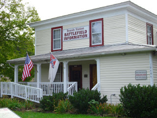
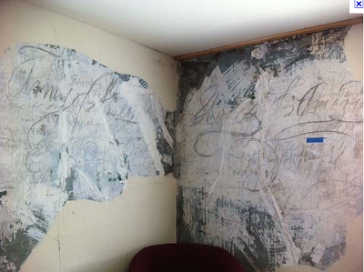
While researching annotations for my great-great-grandfather Charles' Civil War diary, I followed up on his reference to Brandy Station, Virginia, where he was sent in April of 1864 for medical care ("a rather poor place for a sick man," he declared).
It turns out the building in which he would have received treatment is now known as the "Graffiti House", because the walls of the second floor contain inscriptions, drawings, messages, and signatures of Civil War soldiers that were concealed under wallpaper, etc. for many years. The graffiti, according to the Brandy Station Foundation website, "could have been made by soldiers recuperating in the hospital, by other soldiers posted at Brandy Station, or by soldiers passing through the town." There are signatures, drawings, and of particular interest to engrossers (check out that shading!), the "Maryland Scroll". At one point the scroll was removed from the house and acquired by a private collector, but later returned to the Graffiti House in its frame.
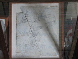 |
| "Maryland Scroll", Graffiti House, Brandy Station VA |
 | |
|
 |
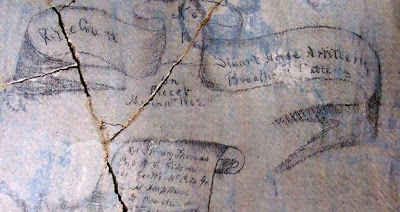
| "Army of the United States of America", Graffiti House, Brandy Station VA |
Love the flourishing!
About a year ago, a stabilizing process was begun on the plaster walls and lo and behold, another signature was uncovered. This is what Michael Sull might call "pedestrian Spencerian", but I think the "F" and "E" caps are pretty cool! I'm guessing they are about a foot tall.
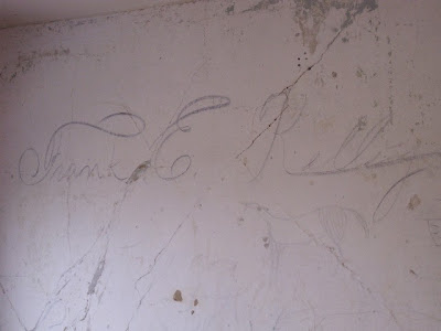
Cheers for the preservationists!
The Saga Continues
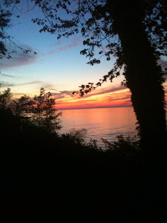
One of the highlights of October was my third visit to Geneva-on-the-Lake, Ohio for the Spencerian Saga. The sunset over Lake Erie the first night could not have been more welcoming.
This year it was the Engrossers' Saga--a once-every-five-year occurrence--and the 25th anniversary of the annual workshop. I've already said plenty about the Saga here, but this one seemed to bring together a lot of things I had been dabbling with and helped me see how I could put them to use in a cohesive piece. Stay tuned for that one...
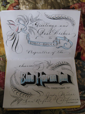
From Ohio I went to meet my sister at my beloved Findley Lake, New York, to stay at the Blue Heron Inn bed-and-breakfast...in the Lakeview Room, of course!
I decided to put some of my new-found skills to work as I signed the guestbook. Maybe no one will ever see it, but I love knowing that it's there!
This year it was the Engrossers' Saga--a once-every-five-year occurrence--and the 25th anniversary of the annual workshop. I've already said plenty about the Saga here, but this one seemed to bring together a lot of things I had been dabbling with and helped me see how I could put them to use in a cohesive piece. Stay tuned for that one...
From Ohio I went to meet my sister at my beloved Findley Lake, New York, to stay at the Blue Heron Inn bed-and-breakfast...in the Lakeview Room, of course!
I decided to put some of my new-found skills to work as I signed the guestbook. Maybe no one will ever see it, but I love knowing that it's there!
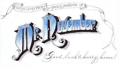
Back home, while messing around on the internet I discovered that my son had been named "Mr. November" at his college back East. Not sure what that's all about, but used it to adorn the 3 X 5 card that will be enclosed with his exam-week care package:
Onward to December...!
Cursive Catastrophe
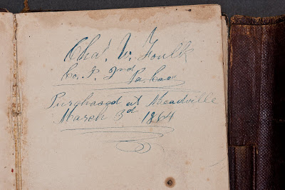 |
| Civil War Diary of Charles Wesley Foulk |
But what I found the most distressing was the account of a 22-year-old and her cousin who found their late Granny's diary but couldn't read it. “ 'It was kind of cryptic,' [the young woman] said. She and the cousin tried to decipher it like one might a code, reading passages back and forth."
Seriously? Are those of us who can read cursive going to become sought-after specialists, the dying breed able to interpret archival material---say, my great-great-grandfather's Civil War diary (the first page of which is pictured above)? I'll admit Charles' authentic Spencerian (according to Michael Sull) handwriting is sometimes challenging to read, but that might be because he was writing with a dip pen in the freezing cold in his army tent. I'm just saying...
On the upside, I see a new opportunity for parents here! When our children were young, my husband and I used to resort to speaking a little Spanish when we didn't want them to know what we were saying (which worked well until their Spanish got way better than ours). Nowadays mom and dad can leave each other notes in plain English that will just look like lovely scribbled designs to their offspring!
In any case, it seems that diary-snooping may be severely curtailed in the near future. So go ahead and let'er rip in your journals, scribes! No one now under twenty will ever know your secrets.
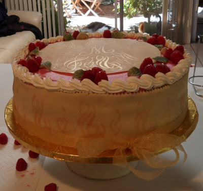
More Calligraphed Confections: Marian's Cake
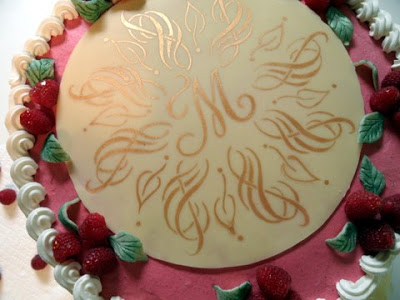
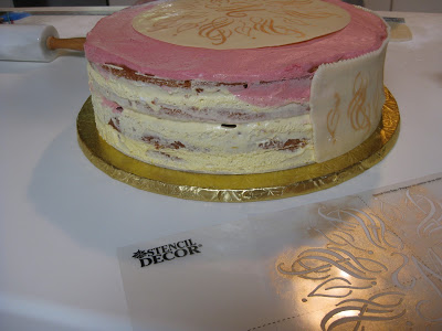
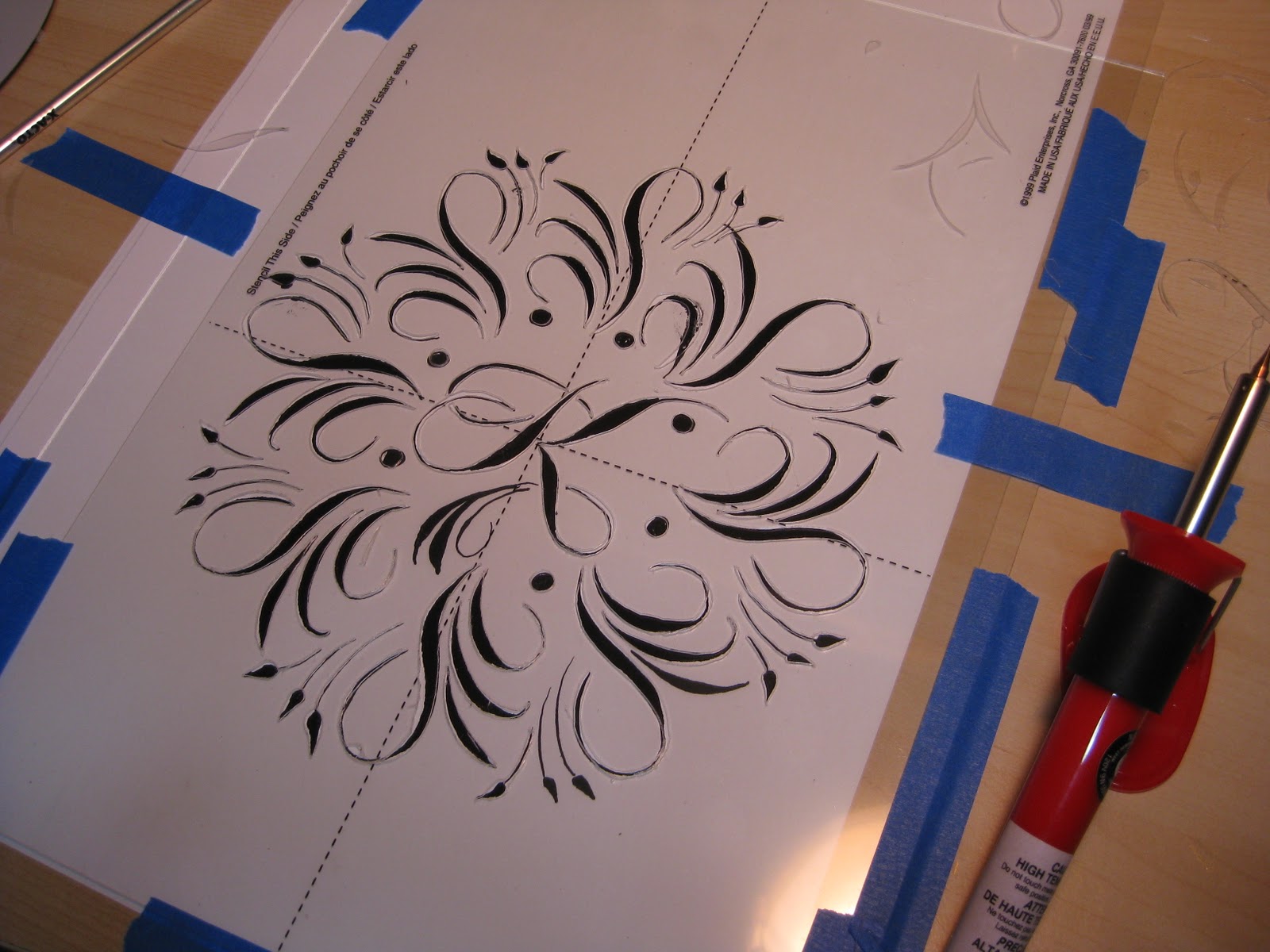
Wendy and I so much enjoyed making the "K" mandala cake that we decided to do it again, this time for my friend Marian, a self-professed diva who is turning 75. My idea was to work a stylized treble clef into the design because she is, after all, a soprano--but treble clefs are so, I don't know, ordinary. There was a lot of trial and error involved, so I worked in pencil on this one.
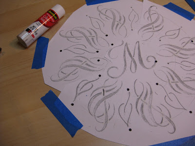
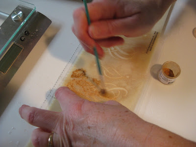
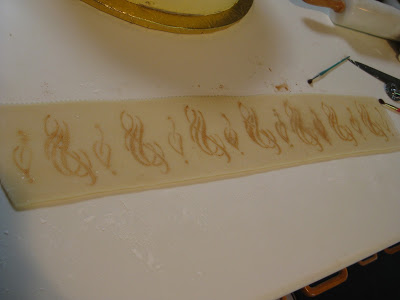
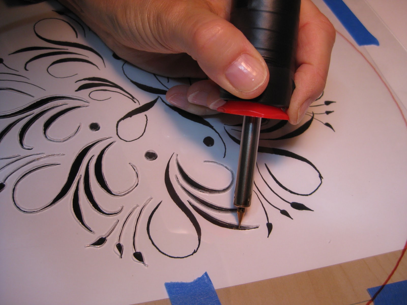
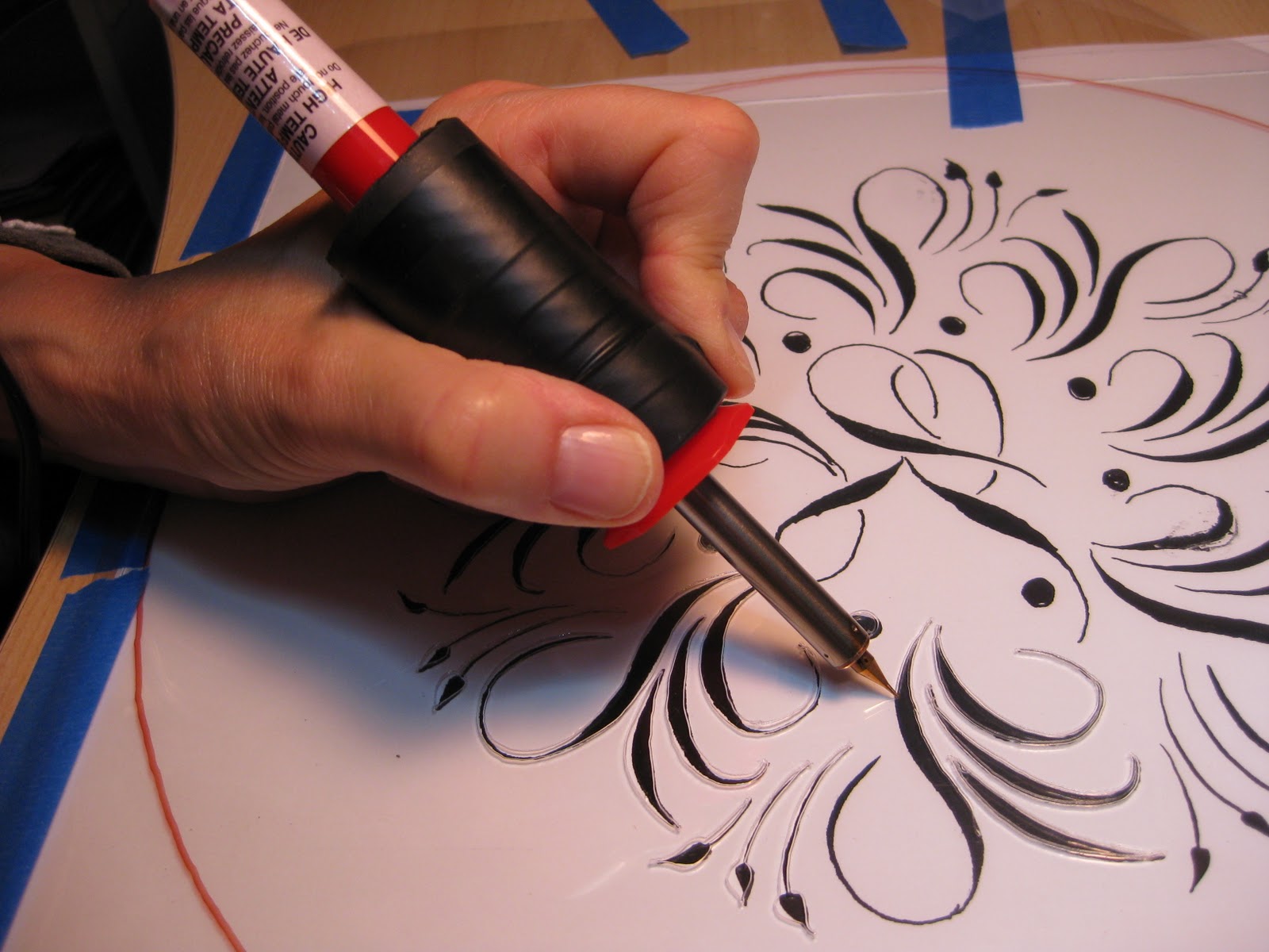
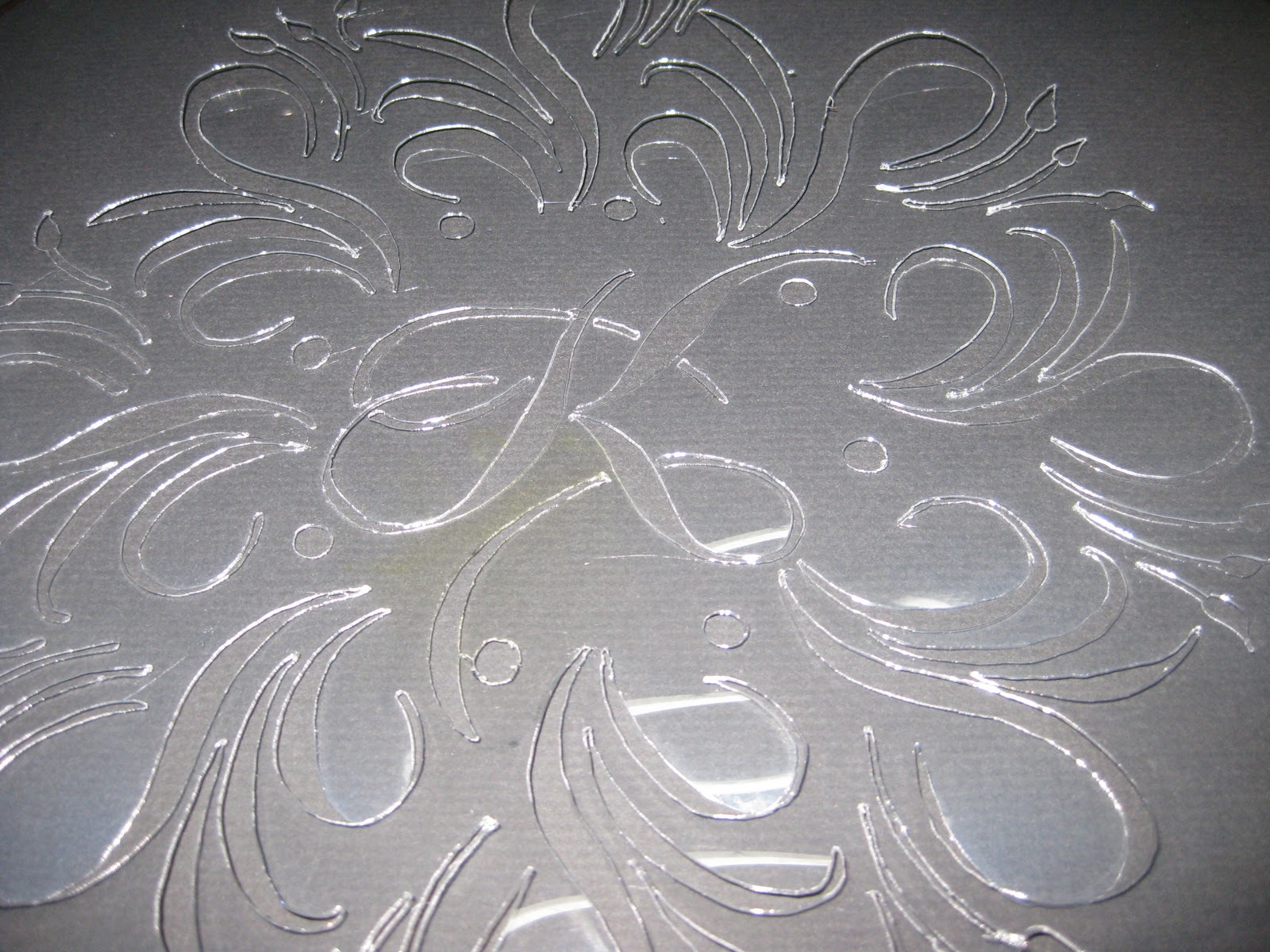
This time I cheated a little bit and when I finally got the motif right I just made seven copies and pasted it up. I added the leaves freehand for some finer contrast. The dots were punched from black paper and glued, making much better circles than I could have done by hand. Again I taped the design to the table, placed a piece of glass over it and then the stencil blank over that. With my handy "burner" tool I cut the stencil in no time at all. Then I headed over to Wendy's to test it with "old gold" lustre dust on parchment paper.

Wendy decided we should do the sides of the cake as well (a 14" creation!) and sent me home to make that stencil. Again, I copied, cut and pasted using elements of the round top design.

By the time I got back to her house, she had applied the gold to the top of the cake, a perfect disk of white chocolate.
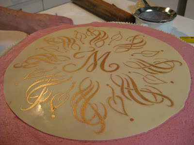

Just imagine: layers of almond-flavored cake alternating with layers of raspberry mousse and lemon cloud illusion (lemon cream made with lemon curd). To die for! We stenciled the sides on two slabs of homemade marzipan (Wendy skinned the almonds herself!). It was a more subtle look than on the white chocolate, probably because of the moisture element.
Here's the first half applied:
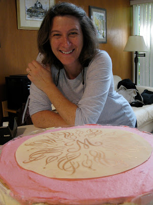
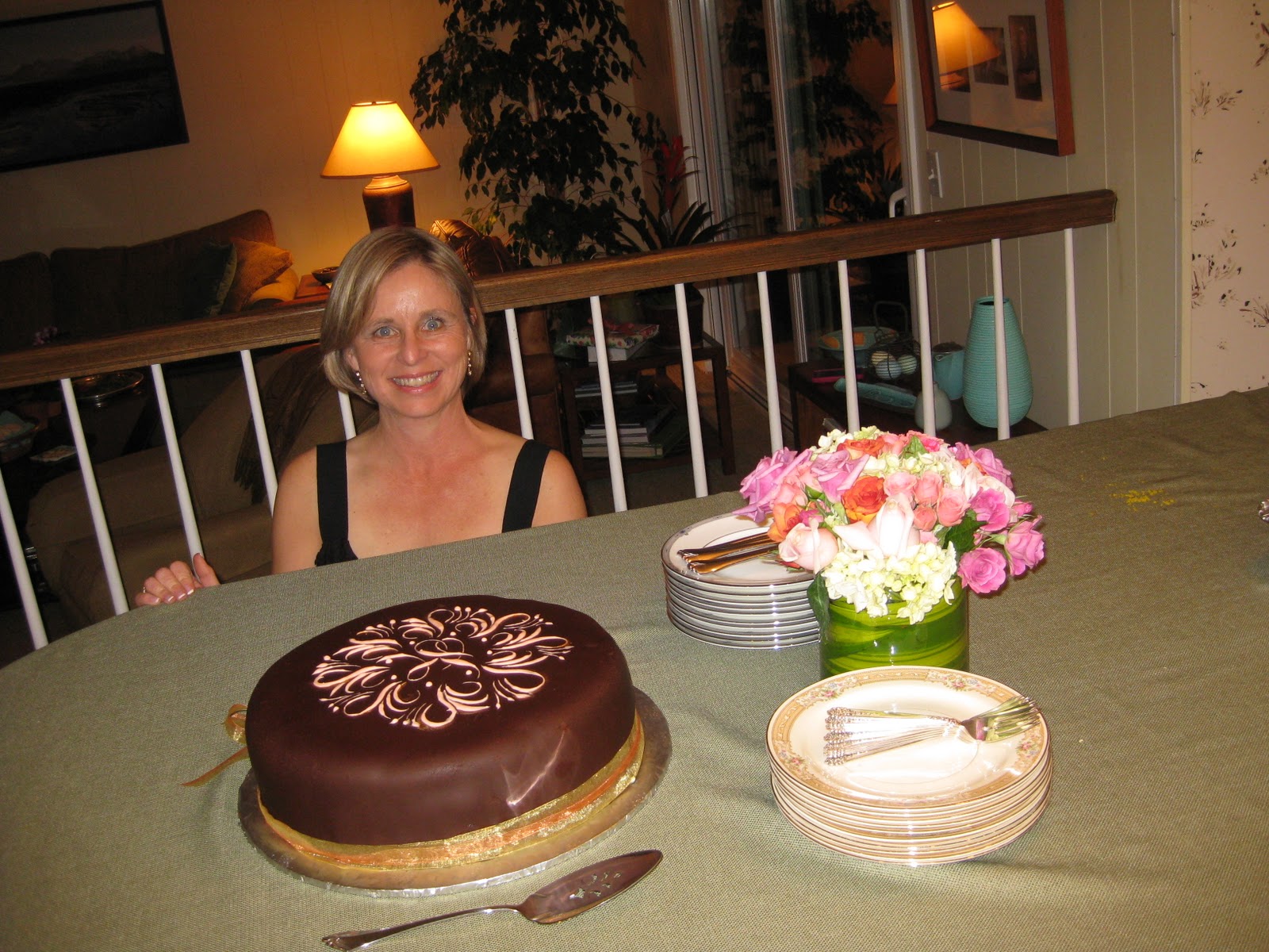
And here's the master pastry chef herself:
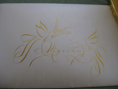
Back into my studio I set to work making a matching card for Marian with my trusty Zebra G nib in Aztec Gold Finetec on Opal Stardust cardstock and envelope.

By the time I picked up the cake the next day for the party, Wendy had worked her magic with piping, fresh raspberries and marzipan leaves.
At the party, the beautiful birthday diva serenaded us with her amazing voice (and we serenaded her back with "Happy Birthday")...

...candles were added for "past, present and future"...
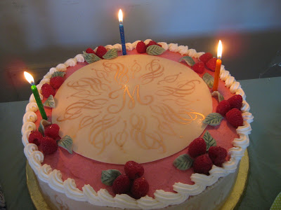
...and then it was time for cake!

Wendy and I are having so much fun with this collaboration! Stay tuned for the letter "T"!
Let Them Eat Cake!: Karen's Cake
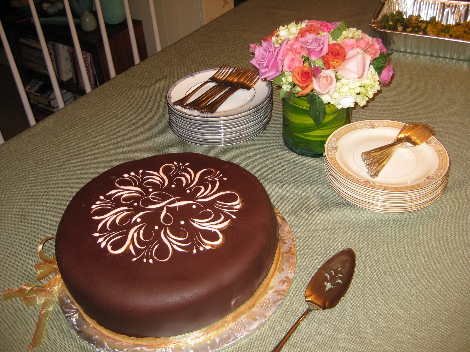
I had already asked my dear neighbor Wendy Remer, an amazing chocolatier, to make a cake for my friend's 50th birthday celebration. Then we saw the latest issue of Martha Stewart Weddings...
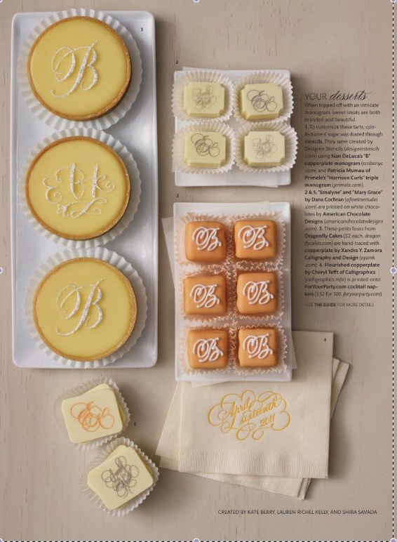
...and were inspired by the wonderful creations of Nan Deluca, Patricia Mumau, Dana Cochran, and Xandra Zamora. We decided to collaborate and create something unique for the occasion.
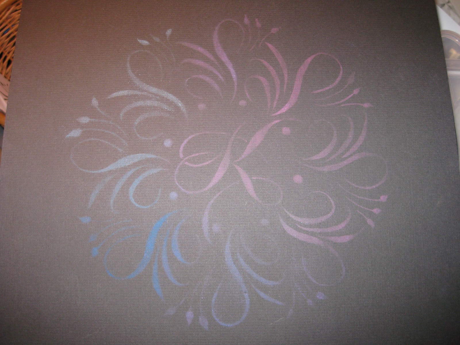
Having admired the work, and especially the mandalas, of Jane Farr, I was delighted to find her outstanding step-by-step instructions for creating them. I penned my first mandala around the initial "K", then headed to Fedex Kinko's (or whatever it's called this week) to make a few enlargements.
With luck (and a 40% off coupon) I found an electric stencil cutter at Michaels--I didn't even know such a thing existed! What a dream to work with! It's kind of like a woodburning tool with a very fine tip. It seems to work well on .003 and thicker acetate sheets, as well as the stencil blanks that are sold for this purpose.
I taped the design to my work table, then a piece of glass over that, and the blank stencil on top. With a little practice I was able to keep the tool moving smoothly enough. (I did have my husband improve the insulation, though--it gets very hot!).
The pieces popped out easily with a craft knife.

I set the stencil over a piece of black paper to make sure I hadn't missed any sections...
...and on a whim, took out my pan chalks and a cotton ball to give it a test run.
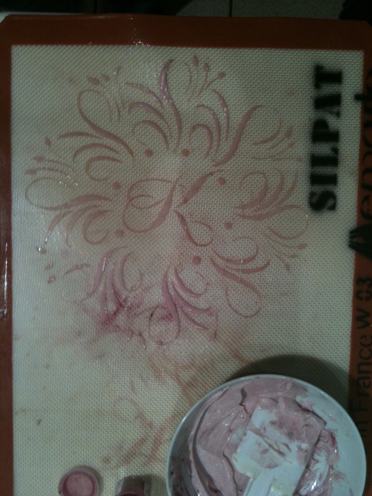
Then it was time to head over to Wendy's for further experimentation! She had seen a video on using stencils with royal icing, which specified that the icing should be the consistency of mayonnaise. She tried out the stencil on her Silpat mat with mayonnaise and pink food coloring. Voila!
Encouraged by success, I cut and pasted elements of the mandala for a stencil to use on the sides of the cake. We ended up not using it after all.

Though next time we'd make it a bit stiffer, the apricot-tinted royal icing was quite striking over the chocolate fondant, and Wendy added some touches of gold dust to dress it up a bit. I made a little matching card to go with it (but forgot to take a picture of it).

The Birthday Girl was glowing and gorgeous!
Everything Old is New Again

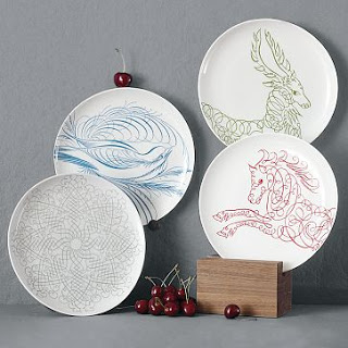
I was walking through West Elm on my way to somewhere else when I spotted these dishes and snapped some photos with my phone. West Elm is a little too trendy for me, but if Offhand Flourishing is hip, I guess I'm cooler than I thought! I haven't sleuthed it but the bird looks suspiciously like something out of E. A. Lupfer's Ornate Pictorial Calligraphy.
The deer and the horse don't have the same graceful thicks and thins, but the idea is definitely there.


I didn't notice it in the store, but according to their website they also have a snowflake, mandala-like design:
 |
| West Elm photo |
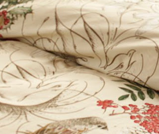
So I guess it should come as no surprise that Pottery Barn, which is also owned by Williams-Sonoma, has also used calligraphy in their holiday bedding design.
 |
| Pottery Barn photo |
In this case the flourishings are relegated to the background, but I think they really make the design:
 |
| Pottery Barn photo |
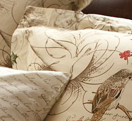 |
| Pottery Barn photo |
 |
| Pottery Barn photo |
 |
| Pottery Barn photo |
So I wondered if this was a running theme in the corporation, and headed to the Williams-Sonoma website. Sure enough. Napkins, tablecloths, mugs, glasses, plates, and even a cookie jar with calligraphy--some recognizably Spencerian--woven in. We're taking over!
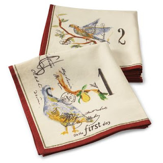 |
| Williams-Sonoma photo |
Disclaimer: West Elm, Pottery Barn, and Williams-Sonoma have no idea who I am; just thought these were fun and wanted to pass them along.
Variation on a Theme

Birthday Central
As long as I have a supply of this pretty green ink, and friends/relatives/colleagues with birthdays, I guess I'll just stay in a flourishing groove and see where it takes me! This one is embellished with Spectralite nickel.
And this one with Twinkling H20s copper.

Mail on the Seat #2
Stationery © Wooster & Prince Papers Inc
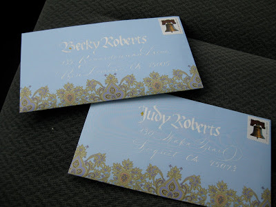
I picked this notepaper up at the wonderful Paperwhite on Kentucky Street in Petaluma. I just love paisley, and there's nothing like a beautiful design to motivate me to get out the pens and ink!
Upcycled Party Favors, Upbeat Party
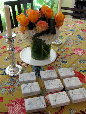
After a several-year hiatus, we finally were able to re-convene, and add to, our group of "Spring Birthday Ladies", which along the way has expanded to include "Honorary Spring Birthday Ladies", meaning pretty much anyone with a birthday and an evening to spend celebrating ourselves.


Though most of us are half-century-ish in age, the group ranged from 24 to 84! It was an extraordinary group of women who inspire me just by being.
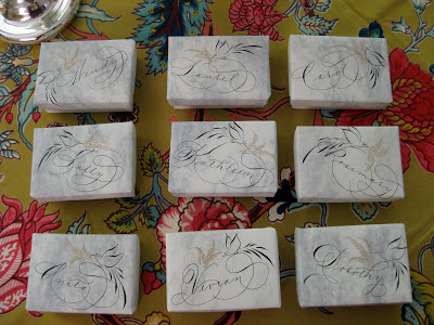
For party favors I wrapped the lids of these boxes in some old stationery after doing a little quickie Spencerian and offhand flourishing. I used Bill Lilly's Pelikan/powdered gum arabic recipe for the black, and Spectralite gold for the flourishes. Though the box itself was the favor, I tucked a little bar of soap into each one to make sure no one was disappointed by an empty box!

You've Got Mail
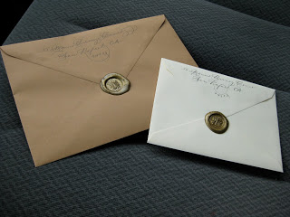
Just a pair of envelopes on the seat of my car, ready to be dropped in the mail on the way to work. Pen, ink, and a dab of sealing wax makes an everyday task more fun!
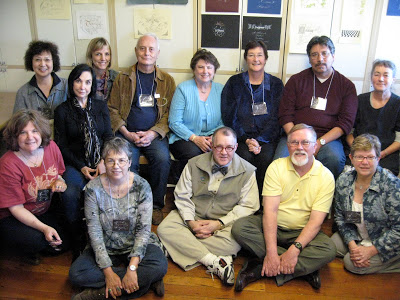
West Coast Saga
The first-ever West Coast Spencerian Saga with master penmen Michael Sull and Bill Kemp concluded over two weeks ago, and I'm still digesting it all.
It was a completely different experience from the longstanding Geneva-on-the-Lake Sagas, which are retreat-like in nature, held at the beautiful Lakehouse Inn on the south shore of Lake Erie in October when the air is crisp and the leaves are turning. Platt Rogers Spencer himself lived, taught, and is buried in Geneva.
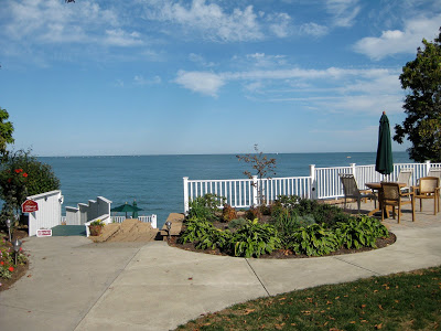
 In April the Berkeley venue, Castle in the Air, is busy, lively, and very connected to the Fourth Street goings-on, with lots of great places to eat and shop during breaks from the pen and ink. Art seems to be in the very air there. And... just a twenty-minute drive across the Richmond bridge from my house!
Both experiences are awesome: the former rich with penmanship history and the latter showing Spencerian's relevance in a contemporary setting.
Bill's digital overhead projector enabled this kind of detail! Sure beat struggling to watch over someone's shoulder. This is a comparison of the Nikko G and EF Principal nibs...
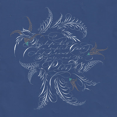
At the top is my final project: My life has a superb cast, but I can't figure out the plot, a quote I love and neglected to attribute to Ashleigh Brilliant. The script is Spencerian, of course, in Dr. Ph. Martin's Bleedproof White with embellishments in Spectralite gold. I used an EF Principal for the text and a Nikko G for the offhand flourishing.
Castle in the Air has published all of our final projects on its blog. I was amazed at the variety and ingenuity as the participants--who ranged from first-timers to twenty-year veterans, hobbyists to seasoned professionals--showcased the variety of techniques we had learned during the week from . It was a fun and lively group!
 And the entire week we had the strangest feeling someone was watching us...
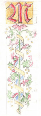
Eleven for the Class of '10
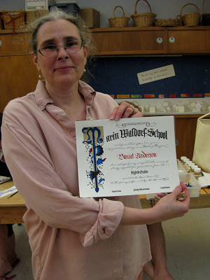
 Last weekend I met with the parents of Marin Waldorf's Class of 2010, while the students were on their eighth grade trip, to help them paint their children's diplomas. This one is all new elements (sometimes I re-use pieces from year to year, see the older ones here) and I'm kind of tickled with my first curved masthead and the little ribbon banner at the top. The lettering is Spencerian and blackletter.
 It was an enthusiastic, talented and focused group! We had ten of eleven families represented, so one parent worked on two diplomas.
It was really fun to hear the conversation as snippets of news about their children were shared.
Notice the poster in the background above: a gloriously engrossed and illuminated poster of the Gettysburg Address! A little unexpected inspiration.


 I wanted a picture of each painter, but my camera battery didn't cooperate. Everyone did a great job and I think they look beautiful!
Spencerian Among the Lakes
 Shortly after attending the Spencerian Saga for the first time I went to visit my son in Maine, and stayed at a lovely B & B called "Among the Lakes". There was a guest book in the great room so I couldn't resist taking pen and ink to practice what I had learned. Imagine my surprise when I went back to their site to try to book another stay, and my entry was featured under "What Our Guests Say"!
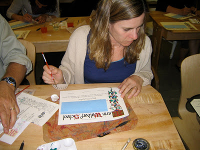
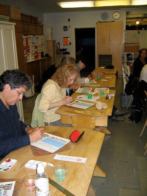
Graduation, Illuminated: Diploma Tutorial
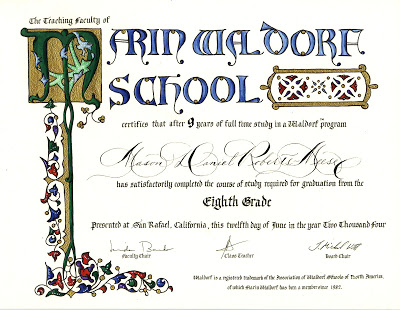
One of my first projects after taking an awesome illumination class with Bill Kemp at Castle in the Air in Berkeley back in 2004 was to design a diploma for my son's eighth grade graduating class at Marin Waldorf School. Since there were only nine graduates that year, I was able to hand paint each of diploma after printing the basic wording and design on my inkjet and inscribing each student's name. The illumination design here is Bill's from the class; I just changed a "W" to an "M".
Word got around, and the next year's class requested a diploma, but I didn't have time to paint them all myself--so I decided to enlist the help of the parents by giving a mini-class in illumination around my kitchen counter.


The end result:
Now it has become an (almost) annual tradition for the parents to gather--often while the class is on its eighth-grade trip--and sometimes they "do it up" with a potluck dinner as well. Groups have ranged from four to about twenty. Each parent paints his/her own child's diploma; if a parent can't attend, usually someone in the group will take on an extra one. It's a bittersweet time for these families who have devoted so much of themselves to the school, and who are preparing for their not-so-little ones to begin the high school adventure.
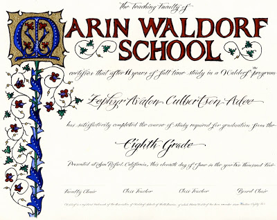
Although I do reuse some elements (usually cutting and pasting digitally), I try to make each year's diploma unique. For Marin Waldorf School, I'm always on the lookout for versions of the letter "M" that will work in this context.
Here is what we start with, printed on diploma parchment or any kind of nice heavy-ish paper that is smooth enough for me to calligraph the name, and sturdy enough to hold up to the gouache with which we will paint it:
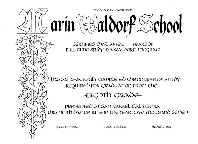
Before meeting with the parents, I inscribe each student's name and cover it thoroughly with post-its to protect it during the painting process.
I prepare a bookmark-sized color key, and copy one for each painter/parent. I like to use pencil because it shows the shadings better, and doesn't "give away" the full effect of the deep-toned gouaches.
Provided for each participant:
- palette
- size 00 or 0 brush
- black gel pen
- water cup
- cardboard cushion
- gouache in red, blue, green, and purple
- Windsor-Newton gold ink
- several burnishing tools (bone folders or backs of spoons will work too)
- several embossing tools
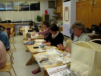
This was a large group, so we used a school classroom. Great concentration!

And the final product:

Here is the most recent edition (sorry for the camera phone photo):
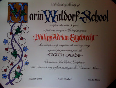
The finishing touch is a diploma cover, which can be purchased for under $5 each. For a few more cents you can even add a tassel! The diplomas are then taken to the appropriate "authorities" to be signed and made official.
It is important to stress that this is about a four-hour process, and because of the specialized tools, materials and instruction involved, is not a take-home project. It's not always easy for busy parents to set aside this much time! But well worth it.
Placecards and Pavlova
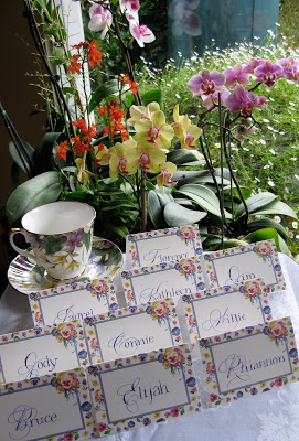
It's Easter Sunday and we're going to brunch later today with our dear friends; as usual my contribution is placecards.

Once again I've mixed styles: Spencerian for the cap and pointed pen Roman miniscules for the rest of the name. I like the playful look. The ink is J. Herbin Violette Pensee´with some Twinkling H2Os mixed in.

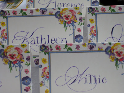
There's a "regular crowd", but I'm always happy when our hostess invites a new "letter". Haven't had an "F" or a "W" in a while!
This year, I'm bringing dessert, too: Pavlova with strawberries. Off to the Farmers Market for the freshest berries to put on top!
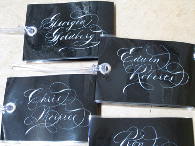
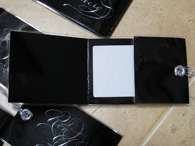
Have Tag Will Travel (Tutorial)

A nice sturdy luggage tag is a big help when you’re trying to recognize your suitcase among all the others. It’s essential if your luggage is lost or misplaced, but it’s not a good idea to have your address readily visible. These tags proclaim the owner loud and clear, but keep contact information tucked inside yet accessible when needed.
Luggage tags were my go-to holiday gift this past season, and people really seemed to like them and want to know how to make them, so here they are.
Materials & Tools
- black (or any deep color) paper, not too heavy, cut 3” X 10½”
- x-acto knife and cutting mat
- ruler
- pen and white ink or gouache (I used Dr. Ph. Martin's Bleedproof White)
- ¼” hole punch
- blank white stickers, approximately 2 ¼ “ X 3 ¼ “ (I used Staples name badge labels)
- ¼ “ (6 mm) eyelet kit (I used Dritz from Jo-Ann Fabrics)
- hammer
- sticky-backed Velcro dots (found these at Jo-Ann’s and at FedEx Office). Alternatively, you can purchase larger pieces and cut them to size, as long as they’re self-adhesive.
- plastic loops for luggage tags known as “worms” [at office stores they usually come in packs of 25 along with laminating pouches (pouches are too small for this project), but they also are available separately in packs of 100 online at http://stores.ebay.com/Pouch-and-Coil__W0QQ_sidZ3406767?_nkw=worm&submit=Search]

- Lightly pencil in vertical dotted lines to define writing area. These lines will also be scored after laminating. Do not fold yet!
- Calligraph name in glorious Spencerian, slightly to the right in the space to leave room for the eyelet.
- Take to office store, (i.e. Staples or FedEx Office) and have laminated with 5 mil film. Three mil would also work but 10 is too thick to fold.
- Trim lamination close to paper all around, leaving about 1/16” to 1/8” of film. Optionally, trim corners (I use a corner punch for this).
- Score firmly along penciled lines on front (side where name is written).
- Fold shorter (2 ½”) side toward back and punch hole as shown through two layers.
- Place sticker on back of tag directly opposite name inscription. It will be on the inside of the luggage tag.
- Insert eyelet through both holes so that it holds the fold in place. (You may need to widen the hole a little by pushing a pen or pencil through it.) Use tools (“anvils”) that come with eyelets and secure with hammer.
- Fold longer (3 ½”) side and tuck under shorter side. It will probably stay in place as is, but will be more securewith Velcro dots attached.
- Loop “worm” through eyelet as shown.
End-of-an-Era Envelope
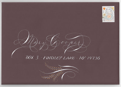
This was the last envelope I sent to a dear old family friend before she moved from her lakeside home of sixty-five years to a high-rise retirement community on Lake Erie---where, by all reports, she is having a blast. I can hardly imagine Findley Lake without her. I would see her during summers my family spent at the lake, and we corresponded regularly the rest of the year thoughout my childhood and beyond. She still writes me long, "newsy" letters, as she calls them, at least a couple of times a month, in hand-addressed envelopes, of course. I try to reciprocate in kind.
The script is, of course, Spencerian, and the blocky lettering is after a style (unnamed?) designed by the inimitable Michael Sull. The ink is Dr. Ph. Martin's Bleedproof White, with the cartouche detailed in Spectralite gold. And of course, the Queen of Hearts stamp is perfect.
Mixing It Up Again
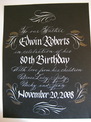
Here's another piece I did for the frontispiece of a family memory book. It is photographed rather than scanned, so the shape looks odd. Again, the contrast of two very different hands, one with pointed and one with a broad nib: this time Spencerian and Blackletter/Pointed Gothic/Johnstonian Italic. The little gold feathery flourishes are done with the pointed pen and Spectralite, a line of paint made for airbrushing. The white is Dr. Ph. Martin's Bleedproof Ink.