Talk to the Animals

© Jody Meese 2015
Bristol board, gouache, 23k gold leaf,
Finetec 'Evening Gold', Moon Palace Sumi Ink

This one was hard to photograph, but the colors are pretty true in the scan above. It was a commission to be given as a gift to a recent veterinary school graduate, to hang in her new office.


The gold is tooled with the traditional pattern that I think of as curled fern fronds.


I wanted the animals to be subtle, so I "hid" them in the border. Best of luck to the newly-minted veterinarian!


Rinka Ronka Reprise

Goauche, gold leaf, Spectralite, Finetec, ink, colored pencils
and crystals on Bristol board

It's auction season again and I was asked to donate a piece to the school where I worked for 25 years, until I 'retired' last June. If you follow this blog you may remember that last year, the curse was broken and not only did my three little pieces raise some serious money, there were people who were willing to match the highest bids so I did two more. This one is essentially the same design as last year, with different colors.

This is the song the children (and their parents!) sing each morning as they file into the classroom. A choir of angels!

Sweet Music

Quote by Stephen Sondheim, Artwork by Jody Meese
Gouache, Spectralite, gold leaf, colored pencils, "jewels", Pitt marker

 These little 5"X5" illuminated pieces (8"X8" framed) are so much fun to do, and perfect items for charity auctions. This one was for the Marin Girls' Chorus. My daughter, a former chorus member, sits on the Board.


Lucky for me, I had help with gilding from visiting calligraphy royalty, Harvest Crittenden! She also offered valuable critique and encouragement.


The mat is some marbled paper I picked up in town...after this photo was taken, I used a ruling pen to add a gold line about 1/4" from the inner edge.

Always fun to contribute to a worthy cause with something I enjoy creating!

Triple Threat


As a mom and school director, I have probably been involved in 25 or 30 charity auctions for schools and sports teams. Over the years it has become painfully clear I have absolutely no sense of what will attract the interest of bidders. Once I copied an item (non-calligraphic) I had seen go for $600 a few years before...then watched it go for 60 bucks, probably less than it cost to make it. Another time I donated anonymously--still no dice. I've even bought back my own stuff to be sure it didn't get tossed! In other words, I am the Kiss of Death (KOD) for auction items.

But I'm giving it one more shot this year! I've chosen three verses that are special to the children and known to the parents at the school, and illuminated the heck out of them. Gold leaf, crystals, Spectralite, Finetec, the works! I figure even if these babies don't go for much, I sure had a great time making them. Each is a little less than 5"x5", and I popped them into 8" x 8" frames.


Please hold a good thought that the KOD curse has lifted, and that these find good homes and raise some golden coins for the magical Mountain School!


Update 3/29/15: There were bidding wars and these puppies raised well over $1K for the school! Yesss! The curse is lifted.

Update 5/15/15: Two families offered to match the top bids on their favorite piece, so now we're over $1900!


B is for...


I always leave the annual IAMPETH conference full of enthusiasm and fresh inspiration, ready to experiment and stretch my comfort zone, and this year is no exception. What a week! There is much to tell, but I'll start here: colored pencils! Bob Hurford taught a short evening session class on the topic and I've been playing around with illumination using Prismacolor Premier pencils. Definitely slower than gouache or watercolor, but for me, easier to control! The "B" is an outline by E. E. Marlatt; the gold is Finetec Inca.

The (Second Half of the) Year in Pictures


Some of my designs for Ultimat Vodka Holiday Campaign
One of five San Francisco venues for Ultimat events in November/December
Very special commission
Commission: walnut ink, watercolor and Finetec gold
Zig Posterman pen on chalkboard fabric
Chalk on display board

Tooled gold leaf
JJ Monogram, pen and ink
JLM monogram, pen and ink
CMS monogram, pencil sketch
Gouache, gold leaf, ink on hotpress watercolor
Piece done in Risa Gettler's Visigothic Versals class; ink,
watercolor pencil,  Finetec gold


Joy to the World!


This project took quite a while to gel, but yesterday it finally came together! I started several weeks ago with an actual scale diagram, taking in to account the television, the cabinet, two framed pieces of art, and even the beam. Oh, the obstacles we face as artists...


The script-y words took a different form--couldn't quite pull off the ribbon look. Of course, with chalk one can keep "fixing" things forever... Unlike the signboards for the school, this is real chalk (not Zig Posterman); my guests tend to be better behaved than the preschoolers. It also doesn't rain inside my house.


My husband kept telling me to add color to the "illuminated" R, but I was curious how far it could go with just black and white. What do you think?


Happy holidays to all, and keep looking for the joy!

Sayonara Sylvia


A longtime colleague is departing at the end of this week, and it is bittersweet for her as well as for those of us staying on.  For some time, she has wanted to teach at the same school her children attend--which will significantly simplify her life, we hope--but she has been with us for many years and we all feel like family.

She loves orange, and wears it well.  I wanted to make a going-away card for her that expresses both her favorite hue and the fire within her that makes her so strong and ambitious!  Inktense pencils, lightly brushed with water, give a flame-like feeling.  For the ornamentation, I remembered learning from Harvest Crittenden how lovely it is to combine gold leaf and shell gold (see the halo in this post);  this is the "poor man's version" with gold leaf over Instacoll, and painted Finetec gold and silver.  I love the dimensional look it gives!

The shadows on the Sickels lettering are Zig gray suede (a heretofore under-appreciated brush pen that has patiently awaited attention in my studio) and HB graphite;  outlining is done with a fine-tip Pitt pen.  The paper is Crane's correspondence card, mounted on a piece of old greeting card (cut with deckle scissors), a piece of metallic gold (ditto), and a Fabriano Medioevalis card.  The final touch was a scattering of random crystals from Michaels, glued on.  Hope she likes it!

Engrossed in Graduation

Once again I was delighted to be asked to design a diploma for the graduating class of the school my kids attended oh-so-long-ago, and to work with the parents on the illumination while the eighth graders were off on their class trip.  The Engrossing Saga I attended last fall was still very much with me, and I went for a kind of turn-of-the-twentieth century look with a twist: part color, part black-and-white.  

The idea is to keep it simple enough that the group can complete the painting in a three-to-four-hour crash course in engrossing.  The design was hand-drawn (Sickels alphabet), calligraphed (Johnstonian Italic), scanned and cleaned up in Photoshop (both twenty-first century luxuries), and inkjet-printed on New Diploma Parchment, whose praises I must join the chorus and sing!  I inscribed the names in Copperplate with Moon Palace Sumi, chose a gouache palette and mixed the colors.  For the gold we used Spectralite, which held up nicely to burnishing and tooling.  Outlining was done with a fine black Pitt pen, and leaf vein dots with a gold gel pen.


We settled into the classroom for a Sunday afternoon and several hours later...


...nineteen diplomas, ready for signatures!


It always amazes me to think that one could actually make a living as an engrosser back in the day!  If only I'd been born in the 1800s--and male, of course--this would have been the profession I aspired to.  Sigh.

Top Brass

Finished size approx. 12" X 16"
The GRAMMY-nominated Bay Brass (has a nice ring to it, does it not?) had organized a concert to honor the recently-retired repairman who has kept their horns--and those of most brass players in the area--in working condition for many years, and to benefit a music camp scholarship fund in his name.  Last-minute scroll request + free design reign + school vacation week = BLISS!  On break from my day job (only job, actually...), I barely left the studio for ten days;  my sweet husband kept me supplied with liquid and solid refreshment while I put to use some of the techniques I have learned in classes these last several years!

As I've said before, Pergamanata paper is a dream for corrections and that's my kinda paper!  I did have a little trouble with the brushed Finetec metallics buckling and flaking off the page, but after a brief consultation with the inimitable Heather Held (thanks, Heather!) I played around with the thickness and that seemed to do the trick.  Next time I would probably pre-treat with gum sandarac, another of her great suggestions.

My initial sketch (full-size):


As usual--and especially since this was a hurry-up job--I planned for it to fit in a standard-sized frame (in this case 16" X 20") from our local craft store.  With my trusty compact mat cutter I double matted it in blue and gold, 2" and 2-1/2" respectively.


Tools and supplies:  Moon Palace sumi; 23k gold leaf; Instacoll; gouache; Finetec gold and silver; Derwent graphite 3B; Zebra G pointed nib; Brause 1mm, 1.5mm and 3 mm;  Micron pigma 005; Uniball signo .18; Copic multiliner .03; Neopiko Line 2 005;  Pergamanata heavyweight paper.  And last but certainly not least:  X-acto knife with #4 stencil blade and Faber-Castell Perfection 7058B eraser!

Border Trouble

I recently learned the expression "border trouble", in this case referring not to immigration---nor to illuminated borders, like the one above---but rather to the sometimes-daunting obstacle between the idea for a piece and the point at which it begins to take shape.  Since I sometimes struggle mightily to move through that region, it helps me to think of it as just a transition, kind of a bothersome ordeal one has to go through to move into the pleasure on working on the piece once it starts to come to life, not to mention once it is finished.

It's school fundraiser season once again and I created this piece to raise some money for a good cause.  Artwork doesn't always do well in a silent auction but this was displayed nicely and went for a pretty penny!  The border outline came from the fabulous collection of the Graphics Fairy (you really need to go to that site, and bookmark it!);  I was able to take a little shortcut and print it onto tracing paper (rather than actually tracing it) and then transferred it to Arches 140 lb hot press with Armenian bole.

Because of the nature of the quote, I used more colors than I usually would have in the border.  The ink is Pelikan (with some powdered gum arabic added);  the rest of the design is gouache, pen, and 23K gold leaf.  I used a [left-handed] Brause 1.5mm nib;  the image is about 7.5" X 10.5".  I used my Logan Compact Mat Cutter (which has come in handy more times than I can count) to cut the mat, then popped it into a frame I picked up at Michael's half-price.  Ta-dah!

Enders Redux

The finished piece in my garden
Olive branch detail
Lettering detail
Halo detail
Once you've been to a place like Enders Island, there's no way you can stay away when you have another chance to go.  My trip last October was still vivid in my mind, and as it turned out, all five of us from that class--plus two new friends-- would be returning to take another class, "Illuminated Prayer on Vellum", with the inimitable Harvest Crittenden at St. Michael's Institute of the Sacred Arts on the island.  (BTW, check out Harvest's brand new Photoshop for Calligraphers online class, coming up in June!)

Sunrise the first morning was worth the trip!

View from my window
Harvest had created a lovely design with haloed dove, olive branches, and text, which we transferred onto sheets of vellum we had prepared with dental-grade pumice.  Over the four days of the class, we learned tips and techniques on gilding, shell gold, color theory (Harvest uses the CMYK palette), shadowing, and how much patience it takes to paint v-e-r-y tiny Roman drawn letters.
Harvest in action
Harvest demos feather detail
My piece in progress
As if that weren't enough, the chef outdid himself and each meal was more amazing than the last.  And for me, the camaraderie and exchange of knowledge and information was just as valuable as the workshop.  It was truly an amazing group of women.

The Class
Translucence
Farewell to Enders

Christmas Comes Early


I don't know about you, but for me the word "clipart" has the connotation of fairly simple, cartoonish images that really are not of much use in the calligraphic world.  But today I am positively swooning over the discovery of University of South Florida's Center for Instructional Technology's Clipart ETC collection! 

At first glance their logo, an ampersand superimposed over a map of Florida, is a good sign--but does not even compare with the riches to come.  There are 60,000 pieces of free, mostly antique black-and-white clipart, and more are being added every week.  Categories include Decorative Letters (just begging to be illuminated!),  Complete Alphabets, Art (including Celtic and other ornaments), Borders (corner, edge, and full page) plus vines, doodads and tailpieces.   Each is offered in three JPEG or GIF sizes and a downloadable 240 dpi TIFF for printing. The database is easily searchable and will yield many treasures!


And best of all, you can use up to fifty of them in a single project without special permission if it is non-commercial or educational (and "not obscene or scandalous"---so tone it down, you wild and crazy scribes). It's a goldmine!

All clipart courtesy FCIT

Once Upon an Island

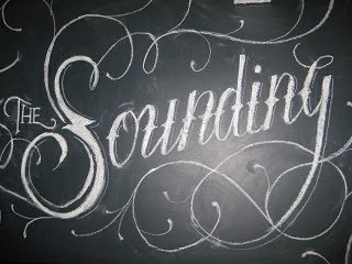
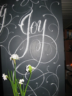
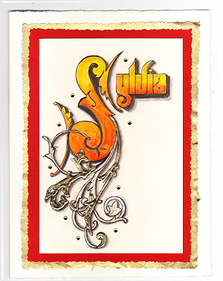
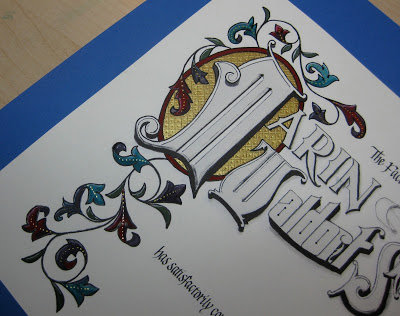
The work in progress...
It was an impulsive and fortuitous decision, clearly meant-to-be:  just a week ahead of time, I put in motion a plan to attend a workshop at the St Michael Institute of Sacred Art entitled "The Decorated Page", taught by the incomparable Harvest Crittenden, herself rather decorated as a Master Penman and Master Engrosser.  I had blocked out a week's vacation--the same week I had gone to the Spencerian Saga the last two years, but I had done a third West Coast Saga in April this year in Berkeley--and had not been able to come up with something that appealed to me to do.  Then I woke up one morning and the plan seemed to have fully formed itself in the night:  
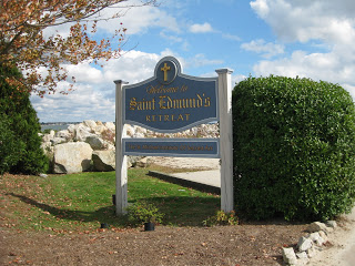
Enders Island, Mystic, Connecticut.

A few emails and phone calls were made, and before I knew it I was on a plane bound for Providence, armed with my left-handed nibs and some delicious anticipation.  Any picture I had in my mind was pale compared to the real thing:
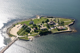
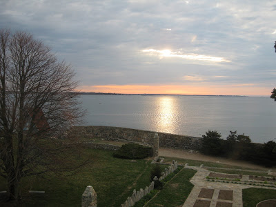
Enders Island, Mystic CT
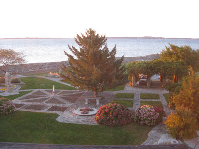
It was sheer magic from the moment we arrived.


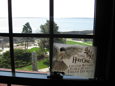
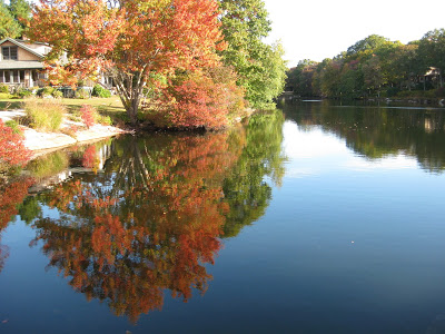
This was the view from my room, the first morning at sunrise:


Autumn was in its full glory and I gratefully got my "fix" of fall color.  This was taken on a walk in a nearby neighborhood.


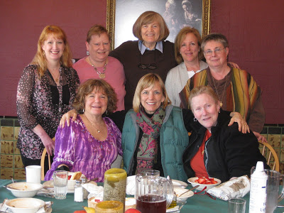
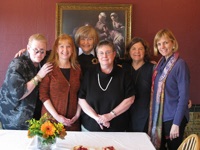
Add to this some fantastic meals and a whole island of friendly people, and the stage was set for an incomparable experience.

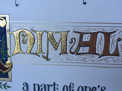
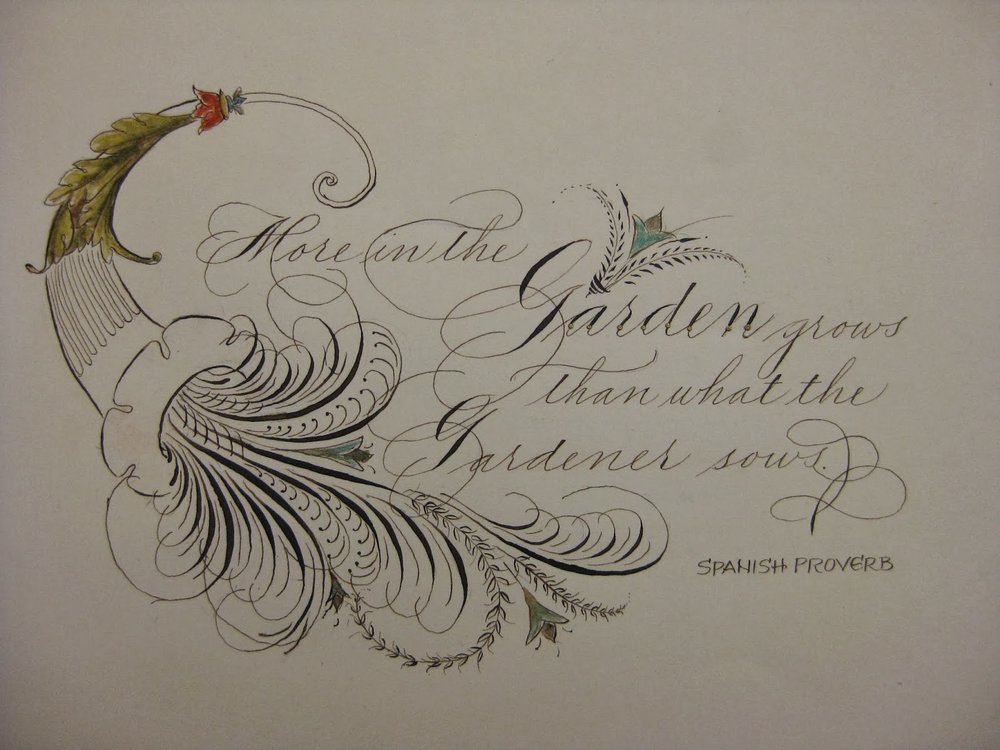
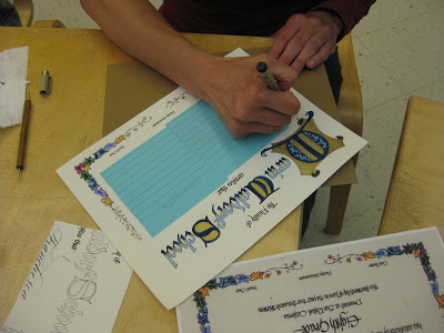
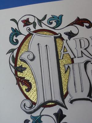
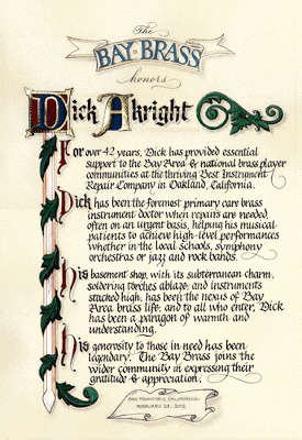
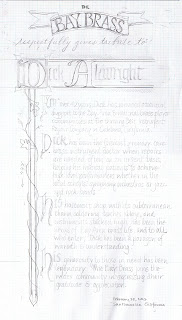
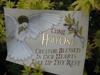
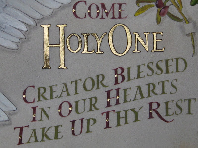
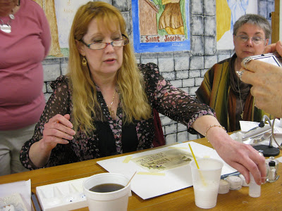
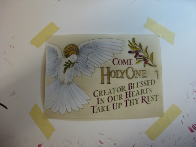
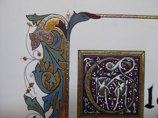
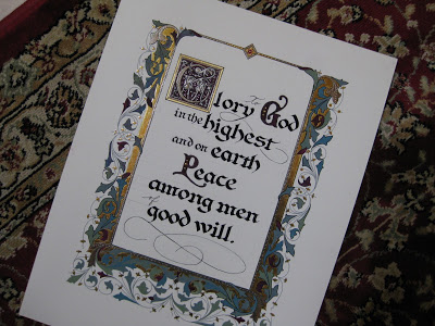
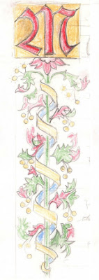
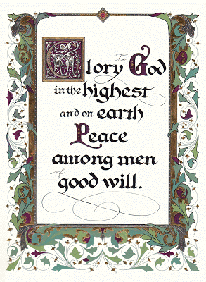
The first two days were spent studying the work of local hero Angelo Rassu, (a mid-20th century engrosser whose amazing collection is housed on Enders and curated by Harvest--stay tuned for her forthcoming publication on him!); practicing Engrosser's Text (new to me, not to be confused with Engrosser's Script!) with a broad nib;  laying out our text designs; and finally, putting the lettering onto the page Harvest had prepared for us with the outline of the border design.


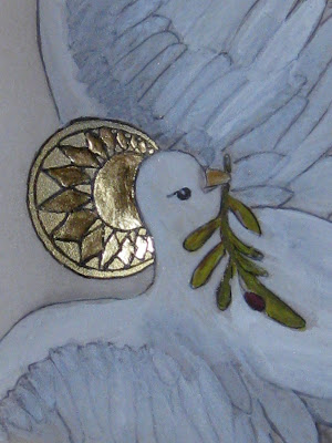
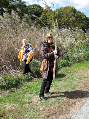
Next we learned to apply gold and palladium leaf.  This included a field trip to a nearby marsh to collect reeds to cut into tubes with which to moisten the dried Instacoll for receiving the leaf.


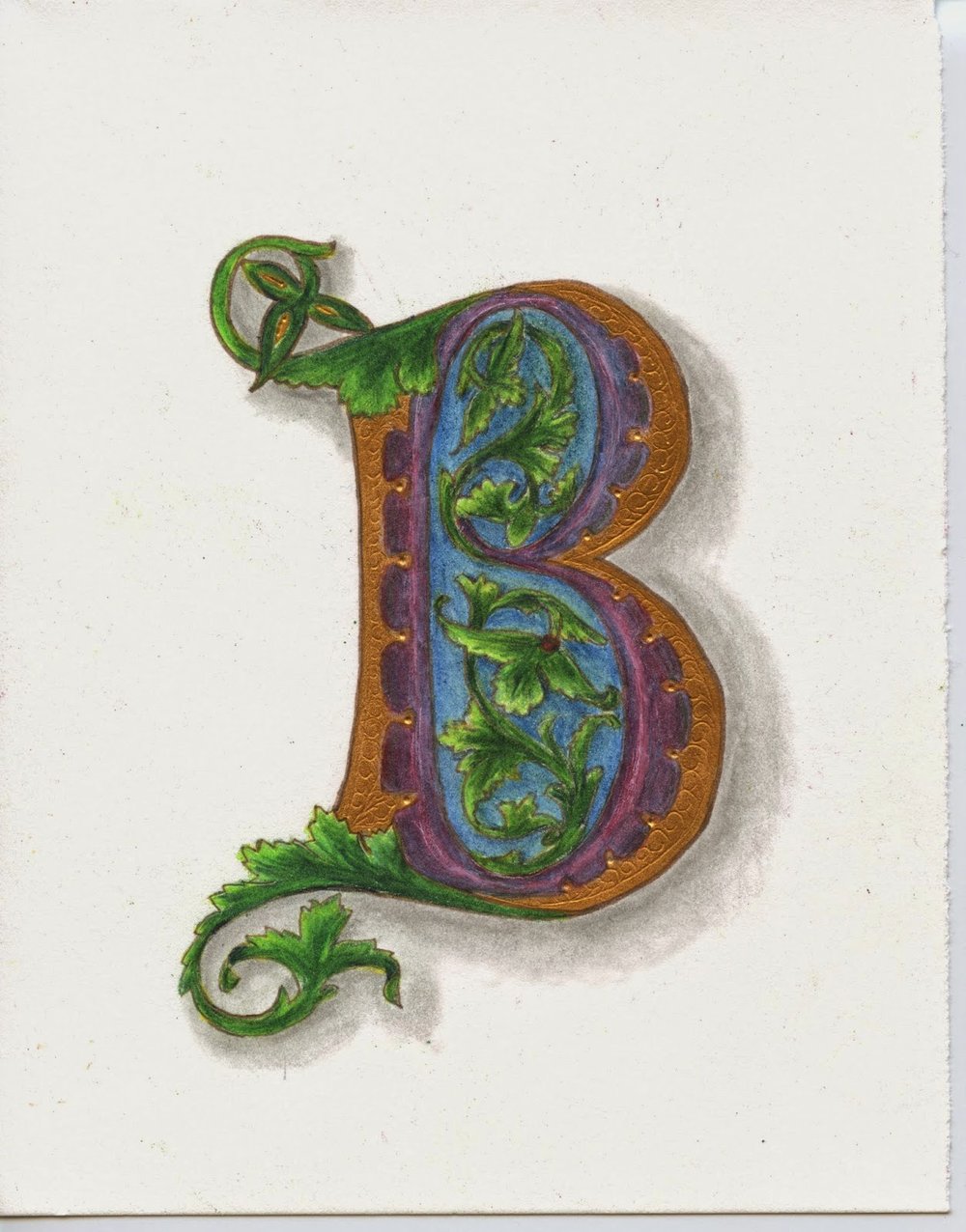
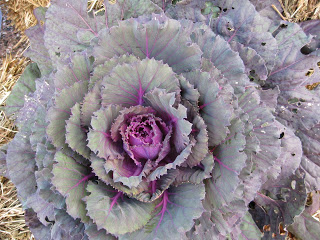
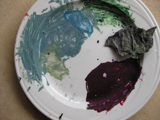
With the gilding beautifully in place, we then were extensively schooled in color theory--specifically Harvest's fabulous CMYK primary palette--and set about creating our colors, hues and shades.  I was drawn to the seasonal decorations in front of the main building (where our scriptorium was housed) which included this ornamental kale...


...and became, with much tutelage from Harvest, this palette of gouache.


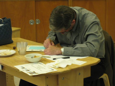
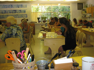
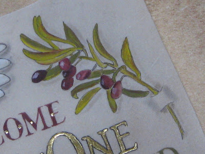
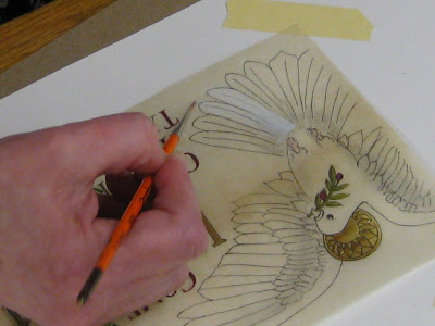
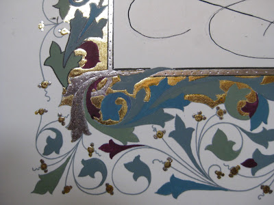
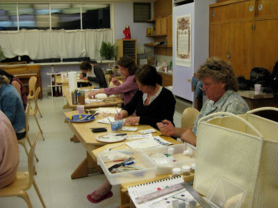
Thus began the Painting of the Acanthus Leaves, a relaxing and pleasurable activity accompanied by Gregorian chant from the workshop upstairs, and/or conversation  (oh, and some SF Giants radio baseball, too, couldn't help myself!)  among the most simpatico group of women I have had the pleasure to be in a class with.


Some of us worked into the wee hours and all enjoyed every minute.  Here are some of the "raw" painted leaves:


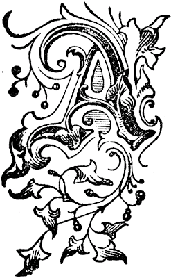
...later shaded and outlined to make them "pop", along with some tooling on the gold.  The illuminated G includes a traditional white vine design.


It is difficult to express how enlightening and restorative those few short days were for me. The place, the people, the art.  In some ways it felt so personal and inward that it is daunting to attempt to put it into words.  I can't say enough about Harvest's teaching: she is thorough, original, imaginative, attentive and flexible---and it goes without saying that her artistry is magnificent inspiration.

I don't know if I'll ever finish this piece, or whether it would even be possible to know when it was finished.  But maybe that's the way to keep the essence of the experience alive for myself.  It's a wonderful reminder that in this era of instant gratification and 24/7 access, one can delve deeply into something for an entire week and know that it has only just begun.


Eleven for the Class of '10

Last weekend I met with the parents of Marin Waldorf's Class of 2010, while the students were on their eighth grade trip, to help them paint their children's diplomas. This one is all new elements (sometimes I re-use pieces from year to year, see the older ones here) and I'm kind of tickled with my first curved masthead and the little ribbon banner at the top. The lettering is Spencerian and blackletter.

It was an enthusiastic, talented and focused group! We had ten of eleven families represented, so one parent worked on two diplomas.


It was really fun to hear the conversation as snippets of news about their children were shared.


Notice the poster in the background above: a gloriously engrossed and illuminated poster of the Gettysburg Address! A little unexpected inspiration.


I wanted a picture of each painter, but my camera battery didn't cooperate. Everyone did a great job and I think they look beautiful!

Graduation, Illuminated: Diploma Tutorial

One of my first projects after taking an awesome illumination class with Bill Kemp at Castle in the Air in Berkeley back in 2004 was to design a diploma for my son's eighth grade graduating class at Marin Waldorf School. Since there were only nine graduates that year, I was able to hand paint each of diploma after printing the basic wording and design on my inkjet and inscribing each student's name. The illumination design here is Bill's from the class; I just changed a "W" to an "M".

Word got around, and the next year's class requested a diploma, but I didn't have time to paint them all myself--so I decided to enlist the help of the parents by giving a mini-class in illumination around my kitchen counter.

The end result:


Now it has become an (almost) annual tradition for the parents to gather--often while the class is on its eighth-grade trip--and sometimes they "do it up" with a potluck dinner as well. Groups have ranged from four to about twenty. Each parent paints his/her own child's diploma; if a parent can't attend, usually someone in the group will take on an extra one. It's a bittersweet time for these families who have devoted so much of themselves to the school, and who are preparing for their not-so-little ones to begin the high school adventure.

Although I do reuse some elements (usually cutting and pasting digitally), I try to make each year's diploma unique. For Marin Waldorf School, I'm always on the lookout for versions of the letter "M" that will work in this context.

Here is what we start with, printed on diploma parchment or any kind of nice heavy-ish paper that is smooth enough for me to calligraph the name, and sturdy enough to hold up to the gouache with which we will paint it:

Before meeting with the parents, I inscribe each student's name and cover it thoroughly with post-its to protect it during the painting process.

I prepare a bookmark-sized color key, and copy one for each painter/parent. I like to use pencil because it shows the shadings better, and doesn't "give away" the full effect of the deep-toned gouaches.

Provided for each participant:
  • palette
  • size 00 or 0 brush
  • black gel pen
  • water cup
  • cardboard cushion
Shared among the group:
  • gouache in red, blue, green, and purple
  • Windsor-Newton gold ink
  • several burnishing tools (bone folders or backs of spoons will work too)
  • several embossing tools
We start by painting the gold background for the illuminated letter. Each coat, as it dries, is burnished. It usually takes about three coats, burnished after each one, until the gold looks opaque. The gold is then "tooled", or debossed, in traditional designs. Next we paint the colors in gouache, following the key card (or not--always a rogue in the group!). Shading is added in slightly deeper tones, and finally everything is outlined carefully in black with a fine point gel pen to set if off and define the design.

This was a large group, so we used a school classroom. Great concentration!


And the final product:

Here is the most recent edition (sorry for the camera phone photo):


The finishing touch is a diploma cover, which can be purchased for under $5 each. For a few more cents you can even add a tassel! The diplomas are then taken to the appropriate "authorities" to be signed and made official.

It is important to stress that this is about a four-hour process, and because of the specialized tools, materials and instruction involved, is not a take-home project. It's not always easy for busy parents to set aside this much time! But well worth it.