Dust-up Wrap-up


Last weekend I did a new wall to welcome seven brave souls who came to learn about lettering with chalk at the "Chalk Lettering Dust-Up". It got good and dusty around here as we worked both on black foam board and on chalkboard-painted masonite boards. In the morning we transferred pre-made sketches to the boards. The short phrases were mostly from Patti Digh's book Four Word Self Help. Everyone did a great job, and each board had a very distinctive look!

Carla

Marjorie

David

Linda

Katy

Janice

Lori


Before lunch, we each personalized our chalkboard painted wine glasses using chalk pencils! Aren't their designs wonderful?!?


In the afternoon we created our own designs in pencil and transferred them. 

Katy

Linda

Janice

Marjorie


David

Carla, the overachiever!

Lori

 ...and we ended with an art show on the back patio! Aren't they amazing?!?


Doesn't it make you want to grab a piece of chalk and start writing???


Sweet Music

Quote by Stephen Sondheim, Artwork by Jody Meese
Gouache, Spectralite, gold leaf, colored pencils, "jewels", Pitt marker

 These little 5"X5" illuminated pieces (8"X8" framed) are so much fun to do, and perfect items for charity auctions. This one was for the Marin Girls' Chorus. My daughter, a former chorus member, sits on the Board.


Lucky for me, I had help with gilding from visiting calligraphy royalty, Harvest Crittenden! She also offered valuable critique and encouragement.


The mat is some marbled paper I picked up in town...after this photo was taken, I used a ruling pen to add a gold line about 1/4" from the inner edge.

Always fun to contribute to a worthy cause with something I enjoy creating!

Chalk One Up


Last weekend I was honored and excited to be asked to teach one of the six mini-workshops at San Francisco Friends of Calligraphy's Trivial Pursuits XXVIII ! The calligraphers' version of speed dating, this event has each teacher meets with five groups of eight for fifty minutes each. The wonderful Evelyn Eldridge chaired the event and made everything run like clockwork.

Planning the class gave me the opportunity to reflect on how I got into doing chalk lettering, which was after a kitchen remodel during which it was suggested we paint a wall black to make it 'disappear'. After a few years of staring at that wall, one Christmas I impulsively wrote a snippet of a carol on it to add to the decorations. This was the humble first one:


I decided to make it an annual tradition, so I made a template on graph paper, blocking out the 'obstacles': TV, framed artwork, beam, etc.


The designs got a teensy bit more elaborate.


And here is this year's iteration.


Of course, there was nowhere near enough time at Trivial Pursuits for something this large in a fifty-minute class! Things had to be scaled down. So a sweet little book by Patti Digh, entitled "Four Word Self Help", came to mind.  Four words seemed doable, so I picked a few of them and made thumbnail sketches to scale for our 15" X 20" black foam boards.


And one more I read somewhere, sometime:


After studying a couple of inspiration boards filled with vintage lettering and alphabets, and establishing a list of elements to work into the design, my FOC colleagues dove right in and transferred one of the phrases onto their pieces of foam board--with, of course, artistic license. It was a joy to see what all these talented calligraphers came up with to make them their own!


A fun event and an inspiring day! Thanks to all for your enthusiasm!

Triple Threat


As a mom and school director, I have probably been involved in 25 or 30 charity auctions for schools and sports teams. Over the years it has become painfully clear I have absolutely no sense of what will attract the interest of bidders. Once I copied an item (non-calligraphic) I had seen go for $600 a few years before...then watched it go for 60 bucks, probably less than it cost to make it. Another time I donated anonymously--still no dice. I've even bought back my own stuff to be sure it didn't get tossed! In other words, I am the Kiss of Death (KOD) for auction items.

But I'm giving it one more shot this year! I've chosen three verses that are special to the children and known to the parents at the school, and illuminated the heck out of them. Gold leaf, crystals, Spectralite, Finetec, the works! I figure even if these babies don't go for much, I sure had a great time making them. Each is a little less than 5"x5", and I popped them into 8" x 8" frames.


Please hold a good thought that the KOD curse has lifted, and that these find good homes and raise some golden coins for the magical Mountain School!


Update 3/29/15: There were bidding wars and these puppies raised well over $1K for the school! Yesss! The curse is lifted.

Update 5/15/15: Two families offered to match the top bids on their favorite piece, so now we're over $1900!


The (Second Half of the) Year in Pictures


Some of my designs for Ultimat Vodka Holiday Campaign
One of five San Francisco venues for Ultimat events in November/December
Very special commission
Commission: walnut ink, watercolor and Finetec gold
Zig Posterman pen on chalkboard fabric
Chalk on display board

Tooled gold leaf
JJ Monogram, pen and ink
JLM monogram, pen and ink
CMS monogram, pencil sketch
Gouache, gold leaf, ink on hotpress watercolor
Piece done in Risa Gettler's Visigothic Versals class; ink,
watercolor pencil,  Finetec gold


Signs of the Times


You just never know where a love of lettering is going to lead you! When there was a work stoppage at the San Francisco Symphony in March, they asked for some signs to replace the hastily scrawled ones they had been using on the picket line. Here are a few of them:


Truth is, these were only slightly less hastily scrawled...I had just three evenings to churn them out. The large sign--which I'm shown below climbing onto the kitchen island to make--was carted around town to identify the musicians while they performed in parks and on street corners.


One of the striking musicians found work as my studio assistant!


Who knows if it was the signs, but the strike did settle in just eighteen days...whereas last time (1996-97) it was ten weeks. Just sayin'...

A very tired sign maker.

Next frontier: tequila bottles. ¡Stay tuned!

Joy to the World!


This project took quite a while to gel, but yesterday it finally came together! I started several weeks ago with an actual scale diagram, taking in to account the television, the cabinet, two framed pieces of art, and even the beam. Oh, the obstacles we face as artists...


The script-y words took a different form--couldn't quite pull off the ribbon look. Of course, with chalk one can keep "fixing" things forever... Unlike the signboards for the school, this is real chalk (not Zig Posterman); my guests tend to be better behaved than the preschoolers. It also doesn't rain inside my house.


My husband kept telling me to add color to the "illuminated" R, but I was curious how far it could go with just black and white. What do you think?


Happy holidays to all, and keep looking for the joy!

Chalk It Up

Oh my, how time does fly.  I have not posted since before IAMPETH...more on that later...but I have found a new way to keep my hand in the lettering world and fulfill some of my work duties at the same time. 

At the school where I work, the old easel we used to post notices finally gave up the ghost and could barely stand.  Happily, I found this "weatherized Oak Street A-Frame Sidewalk Sign" from billyBoards, intended for use with (also weatherproof) Zig Posterman markers. They withstand water, i.e. rain, and come off with Windex.


It's amazing, after a long day in the office, how much I unwind while sketching and chalking these messages!  It's become a (usually) Friday afternoon ritual.


It was a fun challenge to fit all the information on this one:


Since the theme of this one is "Simplicity Holidays", maybe the design ought to have been, well, simpler...


The board is two-sided, so I can be working on one side while still displaying the other. Happiness!

Summer Fun in the Family Room

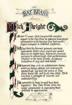
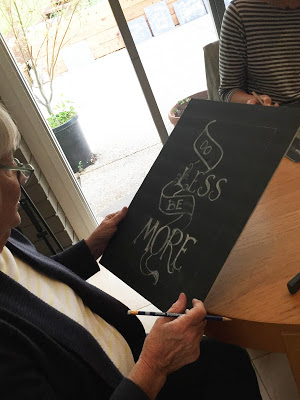
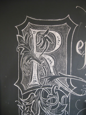
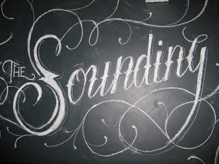
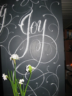
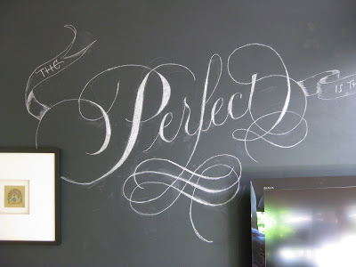
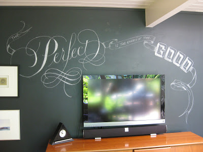
"The Perfect is the enemy of the Good."  ~Voltaire
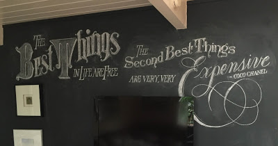
Much to the amusement of friends and family, I've been at it again, scribbling on the walls!  This quote had been rattling around in my brain for a while, and seemed a propos after coming away somewhat intimidated by the hundreds of more-accomplished calligraphers at Calligraphy Northwest last month.  Not that those inspirational folks are the enemy, mind you--I am perfectly capable of taking on that role for myself--but for me, it's an important reminder that just plain "good" is something to feel, well, good about.

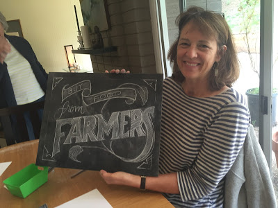
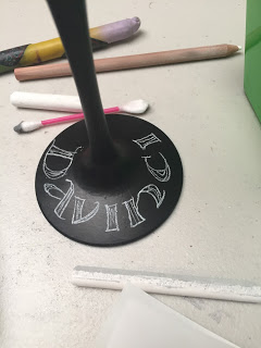
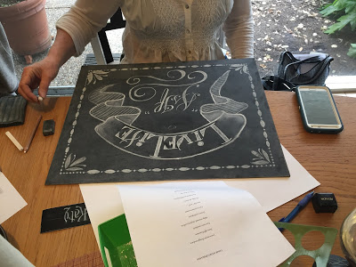
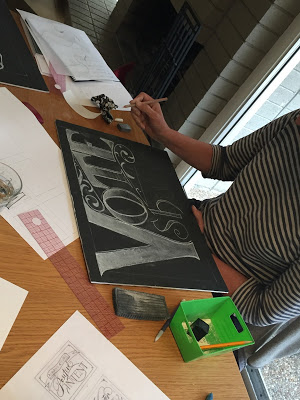
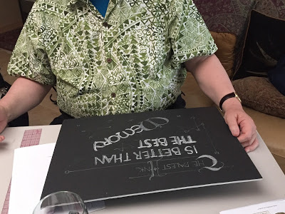
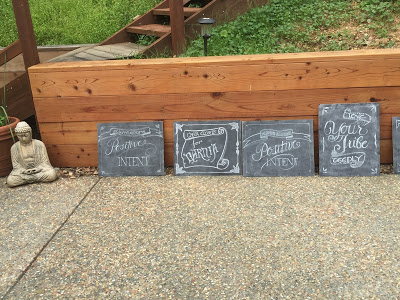
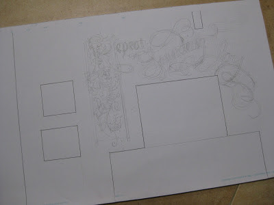
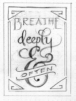
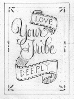
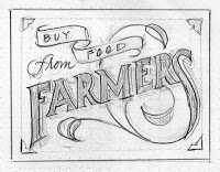
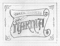
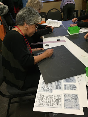
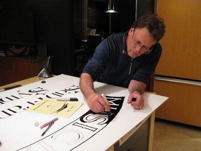
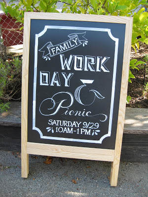
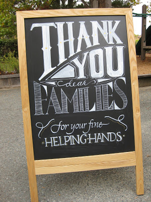
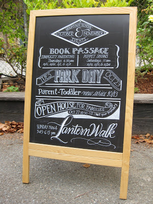
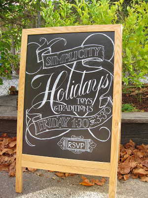
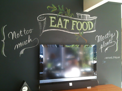
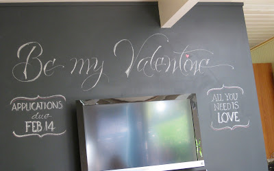
I thought I'd share a bit of process this time.  I started with a little doodle on a graph-paper sticky note;  as usual, television = design challenge.


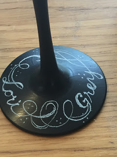
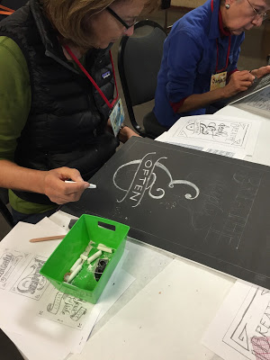
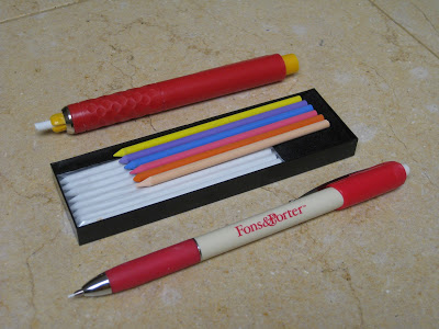
Although the finished project is done with dime store chalk, for some reason it was hard for me to get started with such a blunt tip.  Enter two handy tools, both marketed primarily to quilters:


The Fons & Porter is ultra-fine chalk--about the size of pencil lead--and happens to be sold by Paper & Ink Arts for lining dark envelopes.  The bolder "pen" is made by Dritz and I picked it up at Joann Fabrics.  It comes with a little box of white and colored "leads"! Joy!

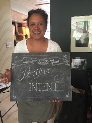
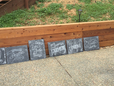
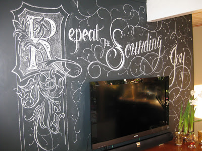
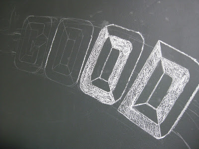
I started out sketching with the Fons & Porter...


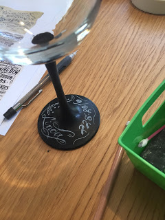
Then defined lines a little more with the chalk pen:


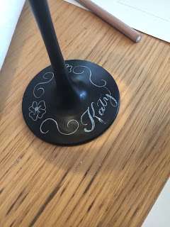
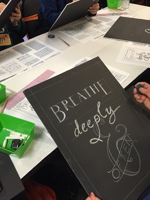
Gradually I filled in and tweaked:


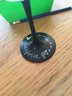
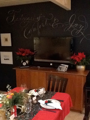
As you can see, there's still some clean-up to do, but I kind of like the chalkiness of it all.  By the way, this wall is painted with plain old latex (hadn't actually planned to be writing on it back then), which is getting a bit trashed by all this foolery.  My "buddy" Martha has a recipe for homemade chalkboard paint, and some great ideas for using it, here.  Check it out!

Best in the Business


Sweet discussion this morning over Father's Day brunch:  my kids say that not every "father" is a "dad", and theirs is a gem and definitely a "dad"!

Hence this doodle on hot press paper:  Pitt marker and brush pens, pewter Derwent metallic pencil, gold pen, and gold leaf over Instacoll.  And the debut of my section liner!  Any irregularities due to user error...

Sayonara Sylvia


A longtime colleague is departing at the end of this week, and it is bittersweet for her as well as for those of us staying on.  For some time, she has wanted to teach at the same school her children attend--which will significantly simplify her life, we hope--but she has been with us for many years and we all feel like family.

She loves orange, and wears it well.  I wanted to make a going-away card for her that expresses both her favorite hue and the fire within her that makes her so strong and ambitious!  Inktense pencils, lightly brushed with water, give a flame-like feeling.  For the ornamentation, I remembered learning from Harvest Crittenden how lovely it is to combine gold leaf and shell gold (see the halo in this post);  this is the "poor man's version" with gold leaf over Instacoll, and painted Finetec gold and silver.  I love the dimensional look it gives!

The shadows on the Sickels lettering are Zig gray suede (a heretofore under-appreciated brush pen that has patiently awaited attention in my studio) and HB graphite;  outlining is done with a fine-tip Pitt pen.  The paper is Crane's correspondence card, mounted on a piece of old greeting card (cut with deckle scissors), a piece of metallic gold (ditto), and a Fabriano Medioevalis card.  The final touch was a scattering of random crystals from Michaels, glued on.  Hope she likes it!

Engrossed in Graduation

Once again I was delighted to be asked to design a diploma for the graduating class of the school my kids attended oh-so-long-ago, and to work with the parents on the illumination while the eighth graders were off on their class trip.  The Engrossing Saga I attended last fall was still very much with me, and I went for a kind of turn-of-the-twentieth century look with a twist: part color, part black-and-white.  

The idea is to keep it simple enough that the group can complete the painting in a three-to-four-hour crash course in engrossing.  The design was hand-drawn (Sickels alphabet), calligraphed (Johnstonian Italic), scanned and cleaned up in Photoshop (both twenty-first century luxuries), and inkjet-printed on New Diploma Parchment, whose praises I must join the chorus and sing!  I inscribed the names in Copperplate with Moon Palace Sumi, chose a gouache palette and mixed the colors.  For the gold we used Spectralite, which held up nicely to burnishing and tooling.  Outlining was done with a fine black Pitt pen, and leaf vein dots with a gold gel pen.


We settled into the classroom for a Sunday afternoon and several hours later...


...nineteen diplomas, ready for signatures!


It always amazes me to think that one could actually make a living as an engrosser back in the day!  If only I'd been born in the 1800s--and male, of course--this would have been the profession I aspired to.  Sigh.

Top Brass

Finished size approx. 12" X 16"
The GRAMMY-nominated Bay Brass (has a nice ring to it, does it not?) had organized a concert to honor the recently-retired repairman who has kept their horns--and those of most brass players in the area--in working condition for many years, and to benefit a music camp scholarship fund in his name.  Last-minute scroll request + free design reign + school vacation week = BLISS!  On break from my day job (only job, actually...), I barely left the studio for ten days;  my sweet husband kept me supplied with liquid and solid refreshment while I put to use some of the techniques I have learned in classes these last several years!

As I've said before, Pergamanata paper is a dream for corrections and that's my kinda paper!  I did have a little trouble with the brushed Finetec metallics buckling and flaking off the page, but after a brief consultation with the inimitable Heather Held (thanks, Heather!) I played around with the thickness and that seemed to do the trick.  Next time I would probably pre-treat with gum sandarac, another of her great suggestions.

My initial sketch (full-size):


As usual--and especially since this was a hurry-up job--I planned for it to fit in a standard-sized frame (in this case 16" X 20") from our local craft store.  With my trusty compact mat cutter I double matted it in blue and gold, 2" and 2-1/2" respectively.


Tools and supplies:  Moon Palace sumi; 23k gold leaf; Instacoll; gouache; Finetec gold and silver; Derwent graphite 3B; Zebra G pointed nib; Brause 1mm, 1.5mm and 3 mm;  Micron pigma 005; Uniball signo .18; Copic multiliner .03; Neopiko Line 2 005;  Pergamanata heavyweight paper.  And last but certainly not least:  X-acto knife with #4 stencil blade and Faber-Castell Perfection 7058B eraser!

Handwriting on the Wall Vol. 3


I am having so much fun with chalk on this big blank wall!  Of course, that pesky TV is in the way but I just view it (so to speak) as a design challenge.  This quote from Bay Area icon Michael Pollan's In Defense of Food: An Eater's Manifesto is a seven-word rule-of-thumb for taking care of ourselves.  (By "food" he means real food as opposed to "edible food-like substances"...).  

To this he has added some new rules in his new illustrated version of Food Rules: An Eater's Manual:  "Give some thought to where your  food comes from."  "If you're not hungry enough to eat an apple, then you're probably not hungry."  "Place a bouquet of flowers on the table and everything will taste twice as good."

Of course this does mean we have to close our eyes when we're packing away a pint of mocha chip...

Handwriting on the Wall


Finally got around to taking down (well, actually just erasing) the Christmas "graffiti" I had done on the almost-black family room wall.  But then it looked kind of empty, so I decided to kick off the next holiday with some more doodling.  Though I have neither the time nor the talent to "chalk up" like the amazing Dana Tanamachi, I find her work inspiring and a whole bunch of fun!  Check out her time-lapse videos here!

The Way I See It

©2011 Jody Meese
We lettering-type people see things a little differently sometimes.  This was a design I'd had in mind for some time, and finally got together for a Christmas gift this year.

A couple who are some of my dearest friends have these names that a) work in crossword form, and b) are perfectly symmetrical when they do. Amazing!  First I drew the letters in Roman caps with a pointed pen, then the ampersand with a broad nib, then mashed them up on PSE9 (BTW the stuff I learned in Harvest Crittenden's"Photoshop for Calligraphers" online class saved me countless hours this holiday season--take it next time it's offered!).  The finished design was uploaded to zazzle and applied to a set of lovely and useful sandstone coasters.
©2011 Jody Meese
(Of course, etched on glass and without the ampersand, the design would be completely reversible!  I'm just saying.  Welcome to the calligrapher's mind...)