|
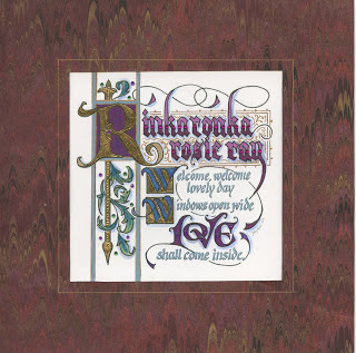
| ©Jody Meese 2016 |
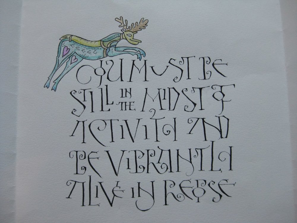
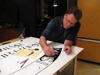
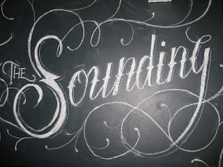
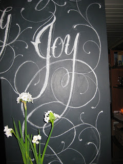
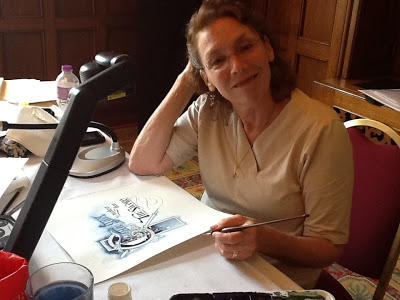
Another commission, a result of previous iterations of a little ditty sung every morning at the preschool. This time I actually thought to document my process and thought I'd share it here, missteps and all.
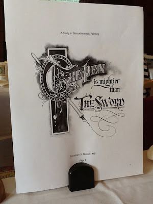
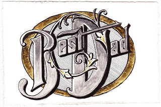
Last year I created the first "Rinka Ronka" illumination as a donation to the auction fundraiser...
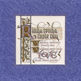 |
| © Jody Meese 2015 |
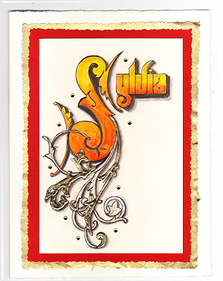
...which led to another...and another...
 |
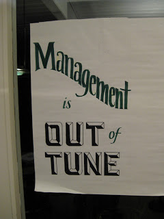
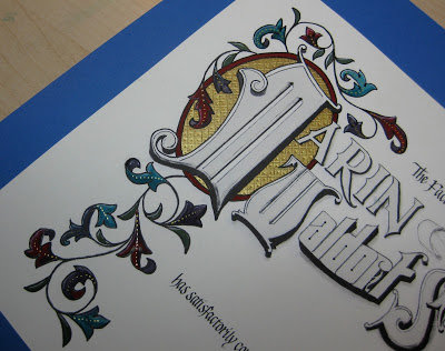
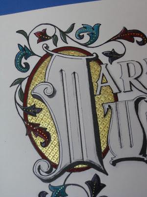
| ©Jody Meese 2016 |
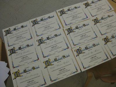
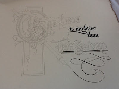
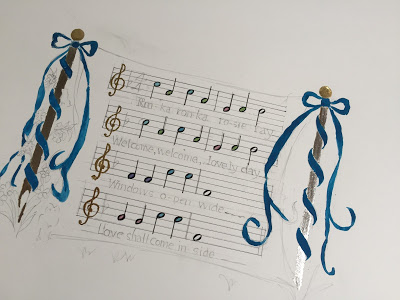
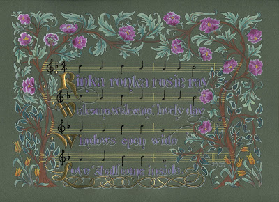
...and then one of the moms asked me to create a piece showing the melody as well as lyrics. Even though (or perhaps because) I have a background in music, I was a bit stumped at the prospect of incorporating the notation into a cohesive piece of engrossing. I sent her two concept sketches (the second one borrowing a border from Angelo Rassu)...
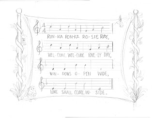

...and she preferred the first, specifically that the lines of music were straight across.
I started working on that design.
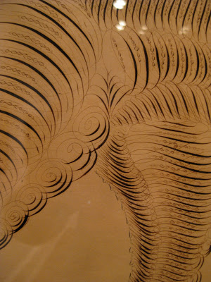
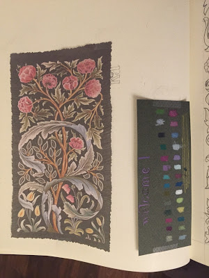
Eventually, I came across this image of a William Morris tapestry design.
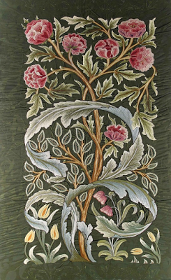 |
| William Morris tapestry |
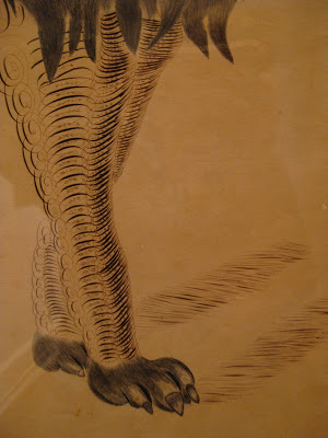
 |
| William Morris tapestry design |
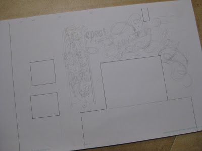
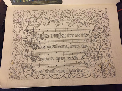
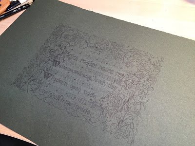
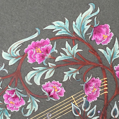
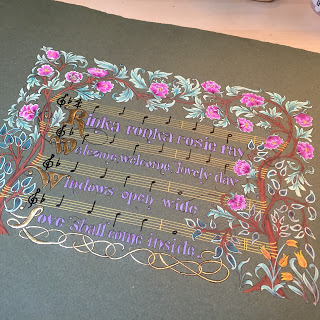
I worked up a sketch making the words larger and the musical notation smaller than the previous design. I planted one of Mr. Morris' fantasy flowering bushes on each side (minus the monster acanthus) and strung the musical staves between them. I tried to compensate for the 'weight' of the treble clefs, time signature, and larger letters on the left by adding more flora on the right, some of it encroaching on the music to fill space in lines with shorter text.
 |
| © Jody Meese 2016 |
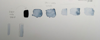
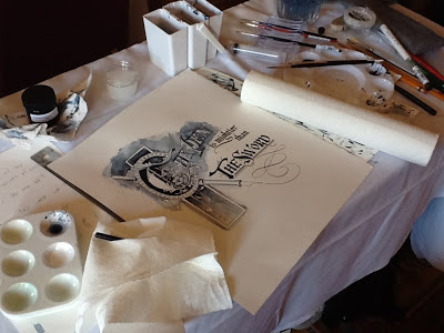
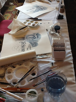
I scanned the sketch into Photoshop and cleaned it up a little. I printed it onto Borden & Riley #90 Vellum Sheer Trace, covered the back in white chalk, placed it chalk-side down on the green paper, and began to transfer the design by tracing over it.

It was working fine, though a little messy (not to mention arduous). I had decided to pick up some white Saral transfer paper to use instead (the graphite color didn't show up well enough) when it hit me--I wonder if I could print right onto the green paper? And the answer was yes.
Ready to go! First the Instacoll, three coats to compensate for a little bit of roughness in the paper (even though I used the smoother side)...
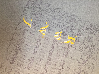
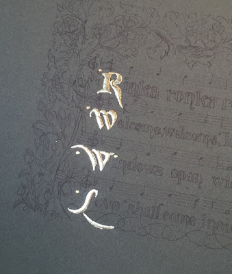
...then the 23k gold leaf...
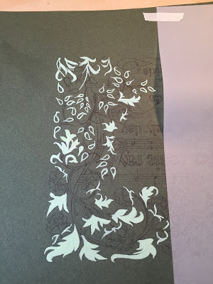
...then the pale green foundation for the leaves, to set them off from the deep color of the paper.
With a little inspiration from a walk in the neighborhood...

...I started in on the flowers and branches, having lined in the music staff with a Pentel Slicci .08 gold pen.
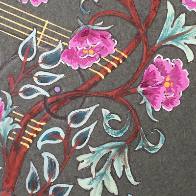
The melody was next, and then the text. The leaves, branches and lettering were outlined in black ink.
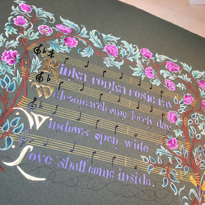
I wrote the melody first with Sumi, but it wasn't showing up very well, so I went back in with a black Sakura glaze pen, which is both glossy and raised. I think notes kind of look like birds on wires!

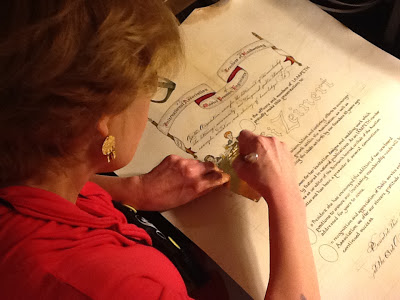
I felt the flourishes across the bottom weren't carrying their weight in the design, so I went over them with Kölner Miniatum Ink and applied gold leaf.
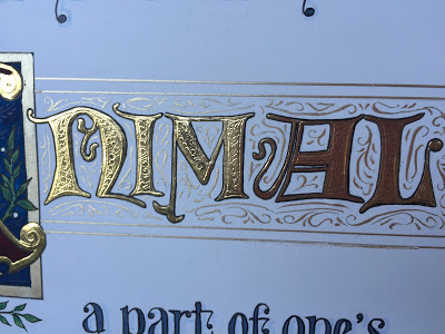
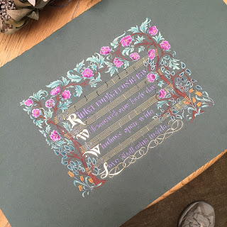
All of the text and flourishes were shadow-lined with white pencil...
...which I then decided I didn't like, and erased the white pencil on all but the first line...
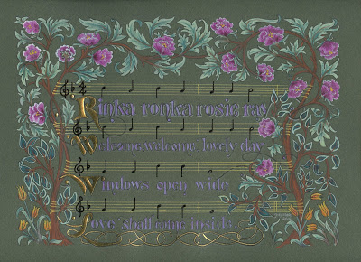
...which I then decided I didn't like either! So it ended up the way you see it at the top of the page (for now!). I made a decision not to tool the gold (again, for now!) because I didn't think it needed it, and well, you have to stop somewhere.
This project was a delight to work on, and I'm a little sad to see it end. Thanks for following along!