Beginning Copperplate Class starts October 10!

Me with my piece exhibited at Kalligraphia in the SF Public Library

Whew! It's been a whirlwind few months, and I'll be posting a little retrospective soon, but wanted to give a shout out to anyone in the Bay Area who is interested in learning Copperplate (pointed pen) calligraphy! I'll be teaching a series of four classes in Marin, currently scheduled for October 10, October 17, October 31 and November 14 from 12:30 to 2:30 each day. For info and registration, go to http://www.meetup.com/Mill-Valley-Calligraphy-Meetup/. Hope to see you there!

The (Second Half of the) Year in Pictures


Some of my designs for Ultimat Vodka Holiday Campaign
One of five San Francisco venues for Ultimat events in November/December
Very special commission
Commission: walnut ink, watercolor and Finetec gold
Zig Posterman pen on chalkboard fabric
Chalk on display board

Tooled gold leaf
JJ Monogram, pen and ink
JLM monogram, pen and ink
CMS monogram, pencil sketch
Gouache, gold leaf, ink on hotpress watercolor
Piece done in Risa Gettler's Visigothic Versals class; ink,
watercolor pencil,  Finetec gold


To Have and to Hold


Bleedproof white lettering,  23 kt gold leaf dots, approx. 9" X 12"
Fourteen years ago we welcomed an exchange student from Germany into our family for a year.  It was in every way a wonderful experience, and we have managed to stay in touch across busy lives.  I had always promised my "German daughter" I would be there when she married, and last weekend, I was!  Here's the beautiful bride just before the fairy-tale wedding on the grounds of a historic castle.


But wait, there's more!  I'm somebody adorable's "American grandma"!


My two grown-up "babies" went along and I loved every minute.  It was a happy, happy occasion.


A Sphinx @ Sixty


So, I turned 60 today!  I'm feeling pretty great about it, despite a young mom at work telling me she couldn't believe I was that old because I'm so "spry".  Ouch.

Anyway, I've had a great day, taking off from work and spending the morning in San Francisco to visit the stunning Cult of Beauty exhibit at the Palace of the Legion of Honor which includes, among multitudinous other treasures, many original William Morris drawings, fabrics and wallpapers.  More peacock feathers and acanthus leaves than you can shake a nib holder at!

Afterward, at the legendary Greens for lunch, we enjoyed great food and a great view (yep, that's our Golden Gate Bridge, turning 75 on May 27th...and I guess she's pretty spry too).


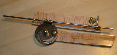
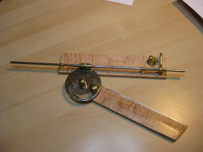
Then my sweet husband presented me with THE coolest gift ever!  You can tell you've been with someone more than half your life when he knows you would be over the moon to receive one of these:


Whatever is it, you might ask?  (The waiter at Greens did!)

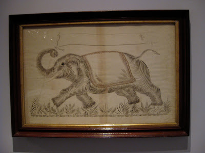
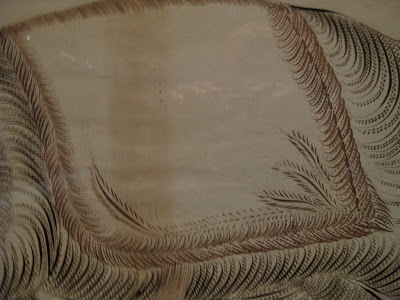
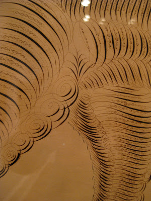
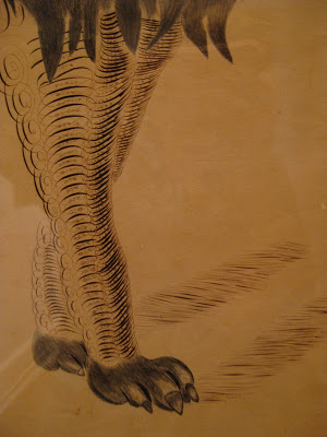
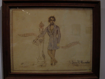
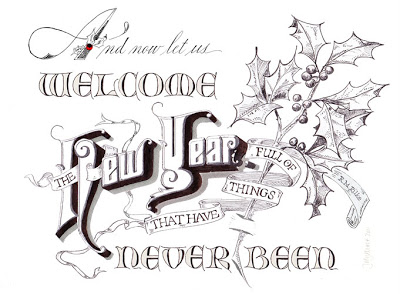
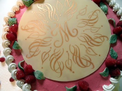
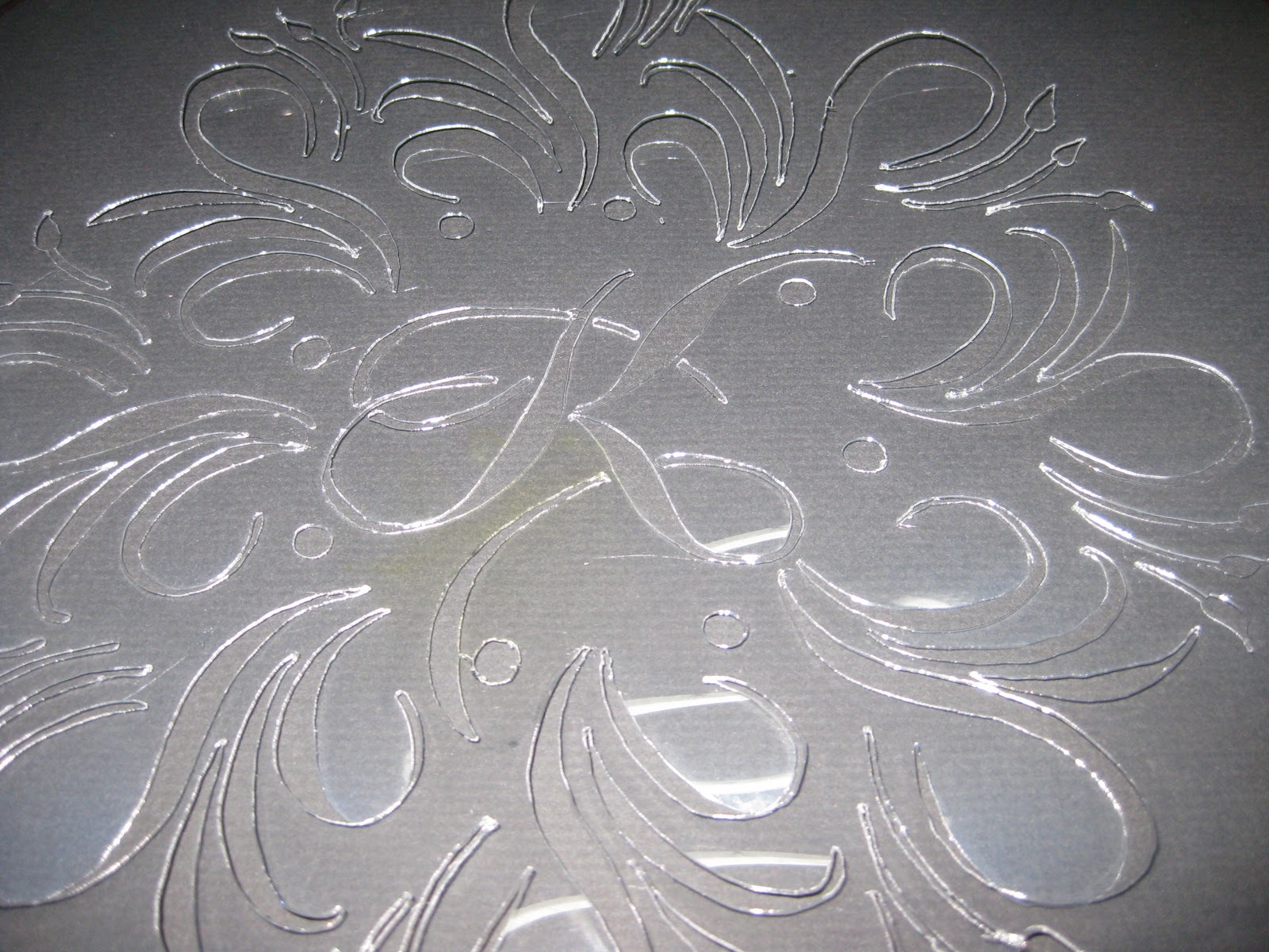
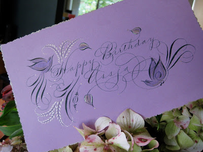
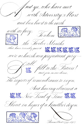
Well, have you ever wondered how the old penmen did those amazing perfectly-spaced lines for shading and definition in black-and-white, like this
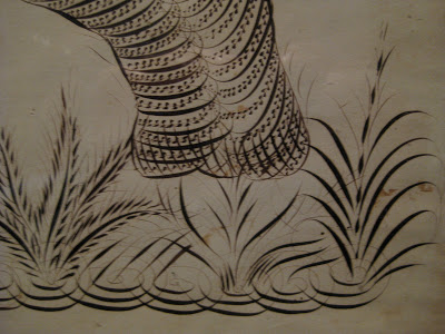
or this?

Bookplate, 1900

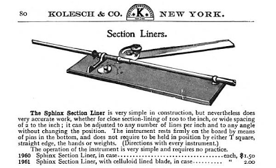
Many used a now-antique drafting tool called a Sphinx Section Liner, also known as a parallel ruler.


They've been very hot items on eBay since pointed pen people caught on to them, sometimes going for several hundred dollars apiece.  Michael Sull demonstrated one (which had been a gift to him from Harvest Crittenden) at the Engrossing Spencerian Saga last October.  I showed Bob Hurford's write-up on the subject (IAMPETH Penman's Journal Summer 2010) to Bruce and he was fascinated with how it worked.  Who knew what he was doing out there in his shop these last few weeks?

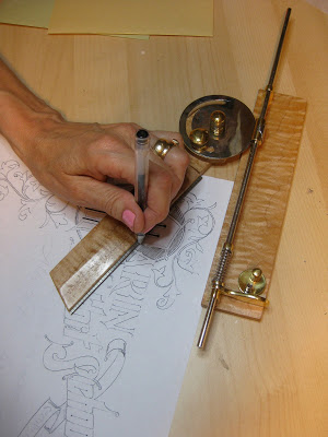
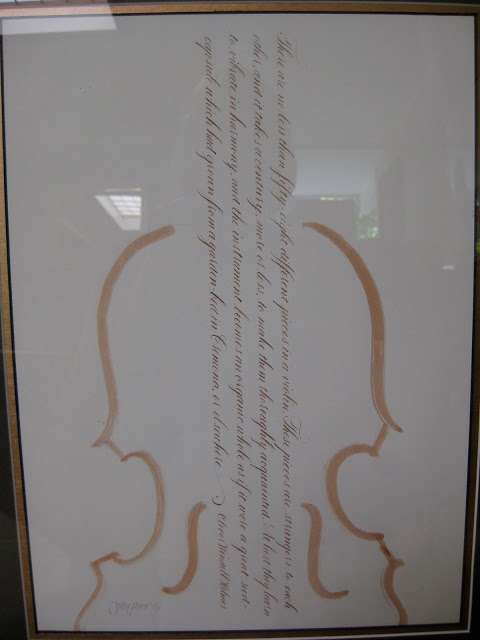
Is it not a thing of beauty?!?  Gorgeous, smooth-as-silk fiddlehead maple and elegant brass parts, the straightedge raised just enough to avoid smudging, and finished off with a beautiful engraved plaque.


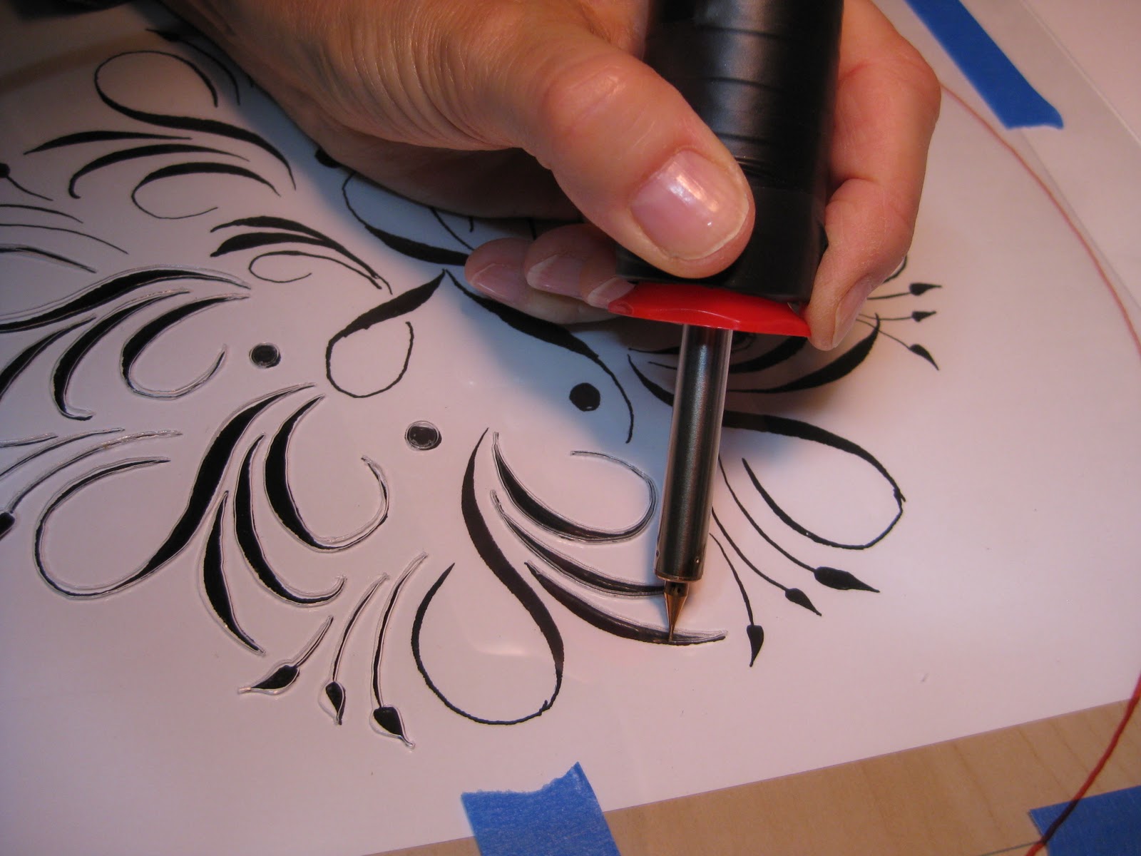
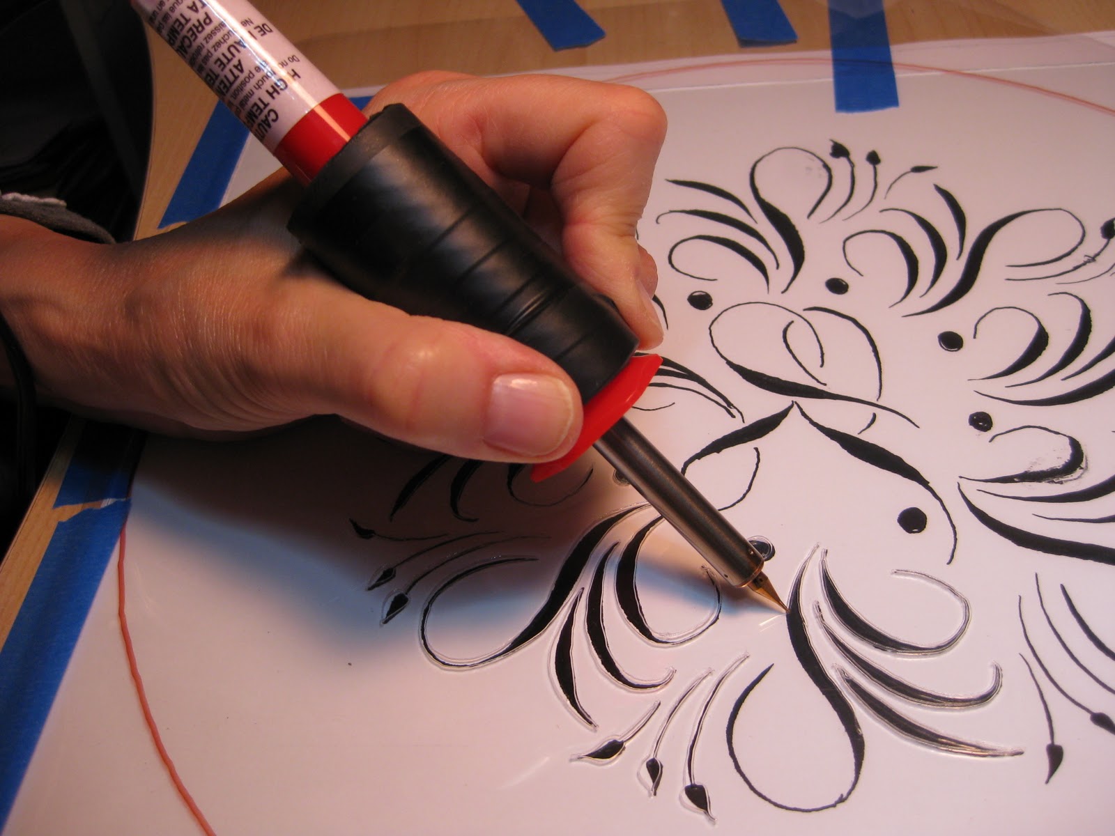
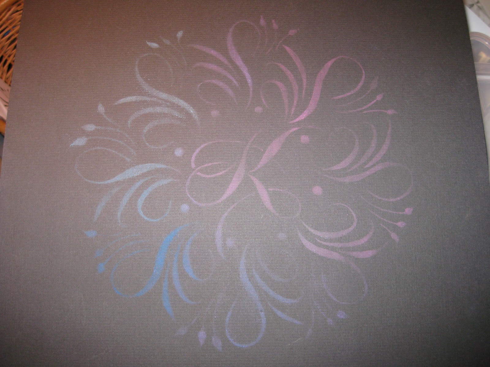
Of course I had to try it out as soon as we got home!  The old masters would have used a ruling pen (another must-have drafting tool) but I went with a G-Tec for my first try.  In the photo I'm kind of using it upside-down and backwards, but as Sheila Waters is fond of reminding me, we left-handers 'have to figure out our own way of doing things'.  Of course, it works perfectly!  And I will treasure it always.


I think sixty might be my new lucky number.

Penwork Where You Find It

"Elephant with Banner", Anonymous
Colby College Museum of Art
The first time I attended Parents' Weekend at Colby College in Maine, I made sure to visit their impressive art museum, one of the finest on any campus anywhere.  I was amazed and delighted to find several examples of penwork hanging proudly in their American Folk Art exhibit.


They even mentioned old Platt Rogers Spencer!  Pretty cool, I thought, since I had just come from the Spencerian Saga...


Some detail on that elephant:


Then there's the King of the Jungle:


"Lion", C.L. Horton
Colby College Museum of Art


And finally, a memorial piece by James Macomber.  Apologies for the blurry photos....


"Mourning Picture of  N.L. Willis", James H. Macomber
Colby College Museum of Art
 The artist rendered his own name in Masterpiece Flourishing!


"Done with a steel pen"

A lovely visit all around!


The Way I See It

©2011 Jody Meese
We lettering-type people see things a little differently sometimes.  This was a design I'd had in mind for some time, and finally got together for a Christmas gift this year.

A couple who are some of my dearest friends have these names that a) work in crossword form, and b) are perfectly symmetrical when they do. Amazing!  First I drew the letters in Roman caps with a pointed pen, then the ampersand with a broad nib, then mashed them up on PSE9 (BTW the stuff I learned in Harvest Crittenden's"Photoshop for Calligraphers" online class saved me countless hours this holiday season--take it next time it's offered!).  The finished design was uploaded to zazzle and applied to a set of lovely and useful sandstone coasters.
©2011 Jody Meese
(Of course, etched on glass and without the ampersand, the design would be completely reversible!  I'm just saying.  Welcome to the calligrapher's mind...)


Generous Jo


One of the great things about the blogosphere, of course, is that we can virtually meet and get to know people who share our passions, however esoteric and obscure they may be (the passions, not the people).  Now I'm willing to bet there's a pretty small percentage of folks on the planet who even know what "dinky dips" are, let alone have figured out a way to make them more elegant and fun.  Enter the wonderful Jo Miller, calligrapher extraordinaire who recently surprised me with a gift of one of her ingenious creations.  "This holder is made from a piece of driftwood reclaimed from Lake Maurepas in southeast Louisiana," she says.  "It has a hand-rubbed finish which feels smooth as glass."  And, I might add, is so light that filling the dinky dip with ink probably doubles its weight.  Thank you, Jo!


Jo has made these available in her etsy shop, where she also has some darling ones made of reclaimed beadboard.  Dinky dips are a necessity for PPPs (Pointed Pen People)--so easy to see and control the amount of ink on the nib.  A wonderful gift for yourself or a calligraphy friend...and guaranteed to take your lettering up a notch!  At least that's what I'm hoping...

More Calligraphed Confections: Marian's Cake


Wendy and I so much enjoyed making the "K" mandala cake that we decided to do it again, this time for my friend Marian,  a self-professed diva who is turning 75.  My idea was to work a stylized treble clef into the design because she is, after all, a soprano--but treble clefs are so, I don't know, ordinary.  There was a lot of trial and error involved, so I worked in pencil on this one.


This time I cheated a little bit and when I finally got the motif right I just made seven copies and pasted it up.  I added the leaves freehand for some finer contrast.  The dots were punched from black paper and glued, making much better circles than I could have done by hand.  Again I taped the design to the table, placed a piece of glass over it and then the stencil blank over that.  With my handy "burner" tool I cut the stencil in no time at all.  Then I headed over to Wendy's to test it with "old gold" lustre dust on parchment paper.


Wendy decided we should do the sides of the cake as well (a 14" creation!) and sent me home to make that stencil.  Again, I copied, cut and pasted using elements of the round top design.


By the time I got back to her house, she had applied the gold to the top of the cake, a perfect disk of white chocolate.


Just imagine:  layers of almond-flavored cake alternating with layers of raspberry mousse and lemon cloud illusion (lemon cream made with lemon curd).  To die for!  We stenciled the sides on two slabs of homemade marzipan (Wendy skinned the almonds herself!).  It was a more subtle look than on the white chocolate, probably because of the moisture element.


Here's the first half applied:


And here's the master pastry chef herself:


Back into my studio I set to work making a matching card for Marian with my trusty Zebra G nib in Aztec Gold Finetec on Opal Stardust cardstock and envelope.


By the time I picked up the cake the next day for the party, Wendy had worked her magic with piping, fresh raspberries and marzipan leaves.


At the party, the beautiful birthday diva serenaded us with her amazing voice (and we serenaded her back with "Happy Birthday")...


...candles were added for "past, present and future"...


...and then it was time for cake!


Wendy and I are having so much fun with this collaboration!  Stay tuned for the letter "T"!

Let Them Eat Cake!: Karen's Cake


I had already asked my dear neighbor Wendy Remer, an amazing chocolatier, to make a cake for my friend's 50th birthday celebration.  Then we saw the latest issue of Martha Stewart Weddings...


...and were inspired by the wonderful creations of Nan Deluca, Patricia Mumau, Dana Cochran, and Xandra Zamora. We decided to collaborate and create something unique for the occasion.

Having admired the work, and especially the mandalas, of Jane Farr, I was delighted to find her outstanding step-by-step instructions for creating them.  I penned my first mandala around the initial "K", then headed to Fedex Kinko's (or whatever it's called this week) to make a few enlargements.

With luck (and a 40% off coupon) I found an electric stencil cutter at Michaels--I didn't even know such a thing existed!  What a dream to work with!  It's kind of like a woodburning tool with a very fine tip.  It seems to work well on .003 and thicker acetate sheets, as well as the stencil blanks that are sold for this purpose.


I taped the design to my work table, then a piece of glass over that, and the blank stencil on top.  With a little practice I was able to keep the tool moving smoothly enough.  (I did have my husband improve the insulation, though--it gets very hot!).


The pieces popped out easily with a craft knife.


I set the stencil over a piece of black paper to make sure I hadn't missed any sections...


...and on a whim, took out my pan chalks and a cotton ball to give it a test run.


Then it was time to head over to Wendy's for further experimentation!  She had seen a video on using stencils with royal icing, which specified that the icing should be the consistency of mayonnaise.  She tried out the stencil on her Silpat mat with mayonnaise and pink food coloring.  Voila!


Encouraged by success, I cut and pasted elements of the mandala for a stencil to use on the sides of the cake.  We ended up not using it after all.


Though next time we'd make it a bit stiffer, the apricot-tinted royal icing was quite striking over the chocolate fondant, and Wendy added some touches of gold dust to dress it up a bit.  I made a little matching card to go with it (but forgot to take a picture of it).


The Birthday Girl was glowing and gorgeous!


Having just finished a wedding envelope job with a lovely forest green ink, and envious of those who were able to attend some of the wonderful flourishing classes offered over the summer, I decided to try my hand and move into Autumn with a greeting for a fine colleague.  The ink is Bill Lilly's recipe of Pelikan 4001 with the addition of powdered gum arabic, brilliant green with a few drops of black.  Also some Spectralite nickel, Twinkling H2O copper, and pastel pencils.  So nice to be back in the studio!

Which Way is Up?


This is a piece I did a while back that continues to puzzle me.  I originally designed it and hung it this way:


...which makes it easier to read.  In fact, another version of it was published in Somerset Studio magazine in the Fall of '05 and they oriented it this way as well.

But then...I lent it to a show for charity, and when I walked in it had been hung this way:


...which I kind of liked.  No so readable, but the texture is nice and maybe more interesting.

What do you think???


(The full text, by Oliver Wendell Holmes:  There are no less than fifty-eight different pieces in a violin.  These pieces are strangers to each other, and it takes a century, more or less, to make them thoroughly acquainted.  At last they learn to vibrate in harmony, and the instrument becomes an organic whole as if it were a great seed-capsule which had grown from a garden bed in Cremona, or elsewhere.)

New Year Anytime


I sometimes wish friends a happy "personal new year" when they are celebrating their birthdays.  But I got to thinking, why stop there? When things haven't been going well, can't we just hit the figurative reset button anytime, return to "Go", tabula rasa?  This was my first in a series of New Year's cards, but now that I look at it, the "Twelve Months that have recently pass'd" could be anytime.  "Still, fill to the Future!...Shout in hopes of a kindlier dozen."

Full text of the poem:

And ye, who have met with Adversity's blast
and been bow'd to the earth with its fury;
To whom the Twelve Months that have recently pass'd
were as harsh as a prejudiced jury---
Still, fill to the Future!  And join in our chime,
the regrets of remembrance to cozen.
And having obtained a New Trial of Time
Shout in hopes of a kindlier dozen.


Thomas Hood (1799-1845)

Pretty in Pink


Still riffing on Judy Detrick's wonderful "Decorated Caps" class for the Friends of Calligraphy a while back!  For these I used my largest broad nib and drew the letters in J. Herbin cyclamen ink, then dropped in my old standby, Spectralite 56K gold (which conveniently comes with an eyedropper installed). 


After the letter was dry (sometimes with a little paper-towel wicking to take away the puddles) I added the rest of the name with pointed pen, full bleed.


Thank goodness for thank-you notes, which give me a great excuse to play!


As always, a beautiful notecard helps to inspire...

Flock o' Placecards


I seem to be on a roll here with placecards, party favors and the like.  But they're fun, easy and usually a lot of bang for the buck.  Borrowing (okay, stealing!) an idea from Martha Stewart's "Messenger Birds" and using images from 19th century Arm & Hammer bird trading cards, mostly found on the wonderful Graphics Fairy blog, I put together these placecards/thank you notes for a luncheon at work. 


According to the Arm & Hammer website:  "This early promotion was a hit and lasted, in various forms, for five decades. The first ARM & HAMMER® cards, 2X3 inches in size, were entitled "Beautiful Birds of America". These cards showcased talented artists and they promoted the importance of preserving our environment."


The ink is McCaffery's ivory.  Word to the wise:  the ink was still tacky and the cards stuck together when stacked, even after drying for twelve hours!  Luckily, no harm done.


What fun it must have been to find one of these in your box of baking soda!

Upcycled Party Favors, Upbeat Party

After a several-year hiatus, we finally were able to re-convene, and add to, our group of "Spring Birthday Ladies", which along the way has expanded to include "Honorary Spring Birthday Ladies", meaning pretty much anyone with a birthday and an evening to spend celebrating ourselves. 


Though most of us are half-century-ish in age, the group ranged from 24 to 84!  It was an extraordinary group of women who inspire me just by being.


For party favors I wrapped the lids of these boxes in some old stationery after doing a little quickie Spencerian and offhand flourishing.  I used Bill Lilly's Pelikan/powdered gum arabic recipe for the black, and Spectralite gold for the flourishes.  Though the box itself was the favor, I tucked a little bar of soap into each one to make sure no one was disappointed by an empty box!