It's a Wrap


Cavallini & Co. images
Perhaps, like me, you are a fan of Cavallini & Co.'s vintage image calendars. And if so, perhaps, also like me, you cannot bear to throw them away. So there they sit in the studio, more years' worth than I care to count, trimmed and neatly stacked...

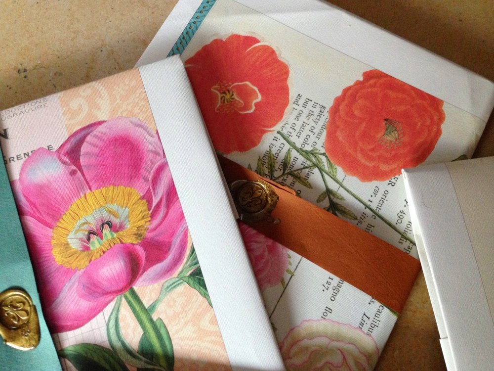
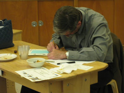
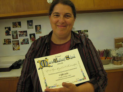
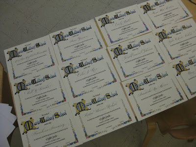
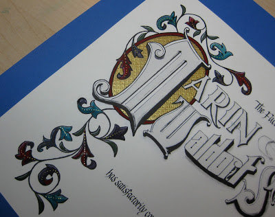
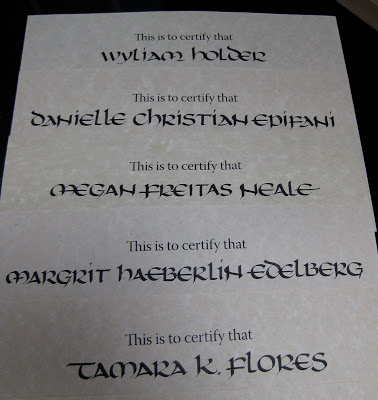
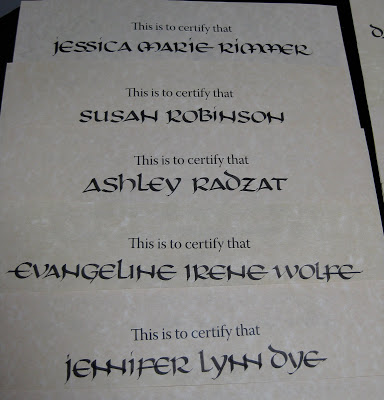
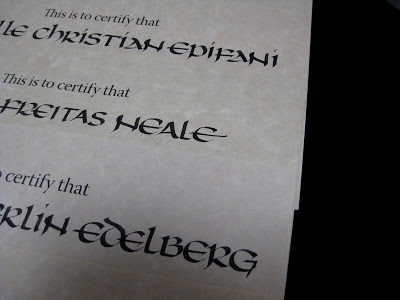
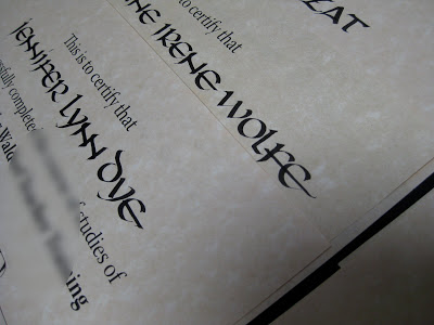
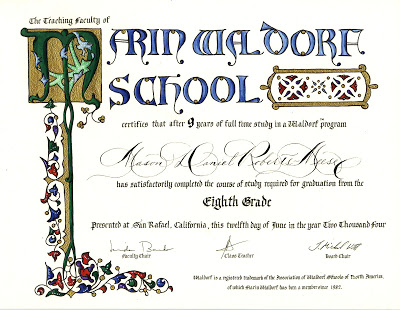
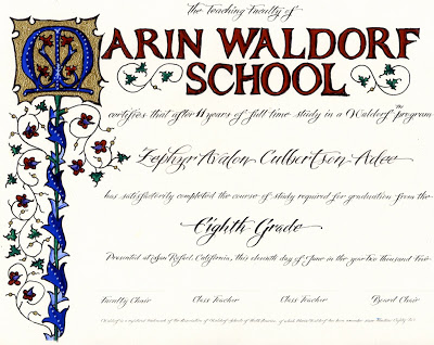
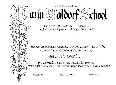
Enter four certificates created for much-appreciated volunteers at my school (sorry, can't reveal them here in the unlikely event the recipients follow my blog). I always hesitate to frame things for other people, not wanting to assume that the piece will live on display rather than tucked in a safe place and taken out occasionally to enjoy. But how to present in a decorative fashion?

Inspiration, fortunately, struck: I took a calendar page, cut a piece of vintage Fabriano colored paper the same size and lay it in as a liner (Canson Mi-Teintes would work well, too), set the certificate in the middle and folded the calendar and the liner squarely. A strip of the same paper was used to made the band, and fastened with fragrant Atelier Gargoyle sealing wax. (I'm a little out of practice with the creme brûlée torch, but it got the job done.)
Cavallini & Co. images

Cavallini & Co. images
Forgot to photograph the backs, but the calendar grid itself is visible, and a little more of the image.

This isn't the first time I've upcycled these gorgeous images; here's a link to my post on some more complex stationery portfolios. Enjoy!

The (Second Half of the) Year in Pictures


Some of my designs for Ultimat Vodka Holiday Campaign
One of five San Francisco venues for Ultimat events in November/December
Very special commission
Commission: walnut ink, watercolor and Finetec gold
Zig Posterman pen on chalkboard fabric
Chalk on display board

Tooled gold leaf
JJ Monogram, pen and ink
JLM monogram, pen and ink
CMS monogram, pencil sketch
Gouache, gold leaf, ink on hotpress watercolor
Piece done in Risa Gettler's Visigothic Versals class; ink,
watercolor pencil,  Finetec gold


Engrossed in Graduation

Once again I was delighted to be asked to design a diploma for the graduating class of the school my kids attended oh-so-long-ago, and to work with the parents on the illumination while the eighth graders were off on their class trip.  The Engrossing Saga I attended last fall was still very much with me, and I went for a kind of turn-of-the-twentieth century look with a twist: part color, part black-and-white.  

The idea is to keep it simple enough that the group can complete the painting in a three-to-four-hour crash course in engrossing.  The design was hand-drawn (Sickels alphabet), calligraphed (Johnstonian Italic), scanned and cleaned up in Photoshop (both twenty-first century luxuries), and inkjet-printed on New Diploma Parchment, whose praises I must join the chorus and sing!  I inscribed the names in Copperplate with Moon Palace Sumi, chose a gouache palette and mixed the colors.  For the gold we used Spectralite, which held up nicely to burnishing and tooling.  Outlining was done with a fine black Pitt pen, and leaf vein dots with a gold gel pen.


We settled into the classroom for a Sunday afternoon and several hours later...


...nineteen diplomas, ready for signatures!


It always amazes me to think that one could actually make a living as an engrosser back in the day!  If only I'd been born in the 1800s--and male, of course--this would have been the profession I aspired to.  Sigh.

Buncha Uncial


There's a local institution that asks me each year to inscribe their graduates' names on their diplomas.  The first year, I was given a sample of their previous calligrapher's work, which was a very bold Uncial hand.  I thought it was a bit odd for a diploma, but have come to appreciate how it goes with the rest of the document (which I'm not showing here, but take my word for it...).  Now I have lots of fun playing with letter variations, "to-dot-or-not-to-dot" (a point on which Ward Dunham and Sheila Waters will forever disagree), and how to squeeze some of those very long names onto the page with this expansive hand.


One solution is to overlap letters---love the double-double-Ns.


Eleven for the Class of '10

Last weekend I met with the parents of Marin Waldorf's Class of 2010, while the students were on their eighth grade trip, to help them paint their children's diplomas. This one is all new elements (sometimes I re-use pieces from year to year, see the older ones here) and I'm kind of tickled with my first curved masthead and the little ribbon banner at the top. The lettering is Spencerian and blackletter.

It was an enthusiastic, talented and focused group! We had ten of eleven families represented, so one parent worked on two diplomas.


It was really fun to hear the conversation as snippets of news about their children were shared.


Notice the poster in the background above: a gloriously engrossed and illuminated poster of the Gettysburg Address! A little unexpected inspiration.


I wanted a picture of each painter, but my camera battery didn't cooperate. Everyone did a great job and I think they look beautiful!

Graduation, Illuminated: Diploma Tutorial

One of my first projects after taking an awesome illumination class with Bill Kemp at Castle in the Air in Berkeley back in 2004 was to design a diploma for my son's eighth grade graduating class at Marin Waldorf School. Since there were only nine graduates that year, I was able to hand paint each of diploma after printing the basic wording and design on my inkjet and inscribing each student's name. The illumination design here is Bill's from the class; I just changed a "W" to an "M".

Word got around, and the next year's class requested a diploma, but I didn't have time to paint them all myself--so I decided to enlist the help of the parents by giving a mini-class in illumination around my kitchen counter.

The end result:


Now it has become an (almost) annual tradition for the parents to gather--often while the class is on its eighth-grade trip--and sometimes they "do it up" with a potluck dinner as well. Groups have ranged from four to about twenty. Each parent paints his/her own child's diploma; if a parent can't attend, usually someone in the group will take on an extra one. It's a bittersweet time for these families who have devoted so much of themselves to the school, and who are preparing for their not-so-little ones to begin the high school adventure.

Although I do reuse some elements (usually cutting and pasting digitally), I try to make each year's diploma unique. For Marin Waldorf School, I'm always on the lookout for versions of the letter "M" that will work in this context.

Here is what we start with, printed on diploma parchment or any kind of nice heavy-ish paper that is smooth enough for me to calligraph the name, and sturdy enough to hold up to the gouache with which we will paint it:

Before meeting with the parents, I inscribe each student's name and cover it thoroughly with post-its to protect it during the painting process.

I prepare a bookmark-sized color key, and copy one for each painter/parent. I like to use pencil because it shows the shadings better, and doesn't "give away" the full effect of the deep-toned gouaches.

Provided for each participant:
  • palette
  • size 00 or 0 brush
  • black gel pen
  • water cup
  • cardboard cushion
Shared among the group:
  • gouache in red, blue, green, and purple
  • Windsor-Newton gold ink
  • several burnishing tools (bone folders or backs of spoons will work too)
  • several embossing tools
We start by painting the gold background for the illuminated letter. Each coat, as it dries, is burnished. It usually takes about three coats, burnished after each one, until the gold looks opaque. The gold is then "tooled", or debossed, in traditional designs. Next we paint the colors in gouache, following the key card (or not--always a rogue in the group!). Shading is added in slightly deeper tones, and finally everything is outlined carefully in black with a fine point gel pen to set if off and define the design.

This was a large group, so we used a school classroom. Great concentration!


And the final product:

Here is the most recent edition (sorry for the camera phone photo):


The finishing touch is a diploma cover, which can be purchased for under $5 each. For a few more cents you can even add a tassel! The diplomas are then taken to the appropriate "authorities" to be signed and made official.

It is important to stress that this is about a four-hour process, and because of the specialized tools, materials and instruction involved, is not a take-home project. It's not always easy for busy parents to set aside this much time! But well worth it.

Mixing It Up Again


Here's another piece I did for the frontispiece of a family memory book. It is photographed rather than scanned, so the shape looks odd. Again, the contrast of two very different hands, one with pointed and one with a broad nib: this time Spencerian and Blackletter/Pointed Gothic/Johnstonian Italic. The little gold feathery flourishes are done with the pointed pen and Spectralite, a line of paint made for airbrushing. The white is Dr. Ph. Martin's Bleedproof Ink.