Triple Threat


As a mom and school director, I have probably been involved in 25 or 30 charity auctions for schools and sports teams. Over the years it has become painfully clear I have absolutely no sense of what will attract the interest of bidders. Once I copied an item (non-calligraphic) I had seen go for $600 a few years before...then watched it go for 60 bucks, probably less than it cost to make it. Another time I donated anonymously--still no dice. I've even bought back my own stuff to be sure it didn't get tossed! In other words, I am the Kiss of Death (KOD) for auction items.

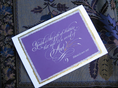
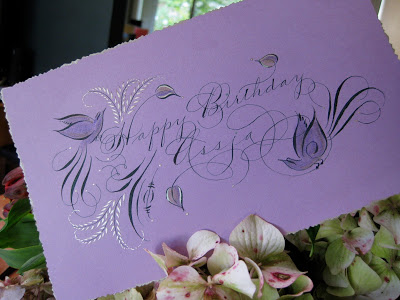
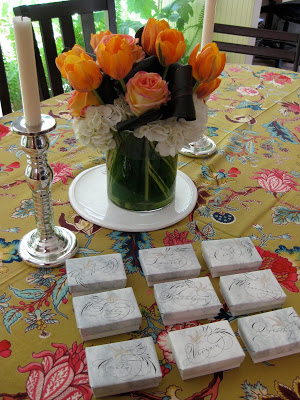
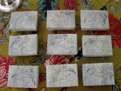
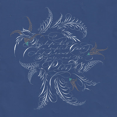
But I'm giving it one more shot this year! I've chosen three verses that are special to the children and known to the parents at the school, and illuminated the heck out of them. Gold leaf, crystals, Spectralite, Finetec, the works! I figure even if these babies don't go for much, I sure had a great time making them. Each is a little less than 5"x5", and I popped them into 8" x 8" frames.


Please hold a good thought that the KOD curse has lifted, and that these find good homes and raise some golden coins for the magical Mountain School!


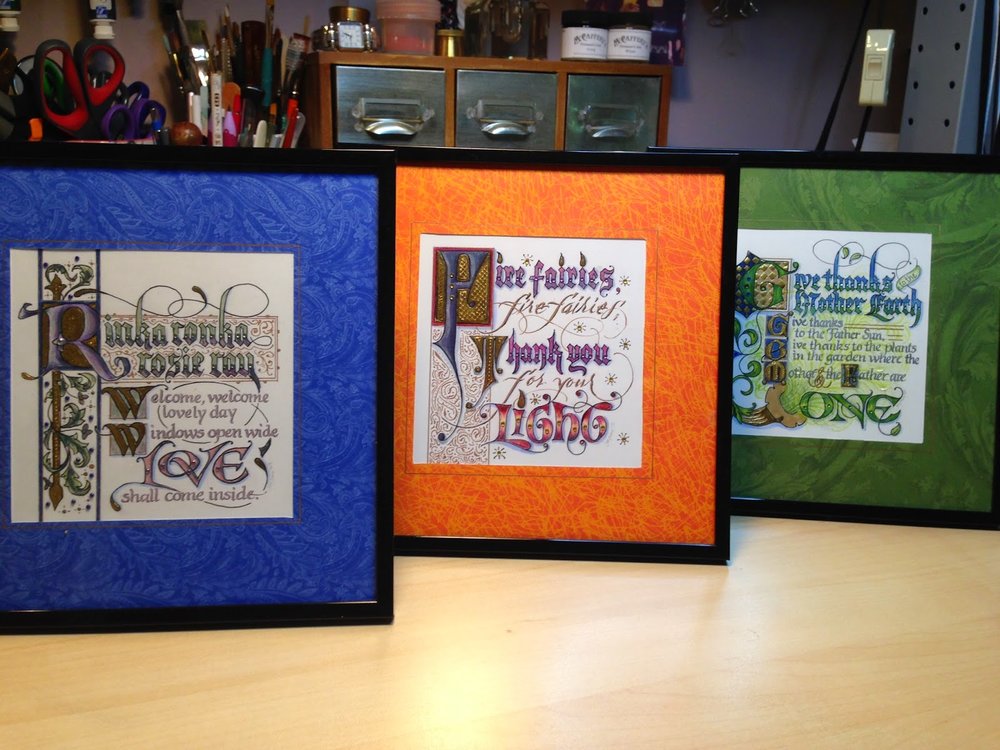
Update 3/29/15: There were bidding wars and these puppies raised well over $1K for the school! Yesss! The curse is lifted.

Update 5/15/15: Two families offered to match the top bids on their favorite piece, so now we're over $1900!


Engrossed in Graduation

Once again I was delighted to be asked to design a diploma for the graduating class of the school my kids attended oh-so-long-ago, and to work with the parents on the illumination while the eighth graders were off on their class trip.  The Engrossing Saga I attended last fall was still very much with me, and I went for a kind of turn-of-the-twentieth century look with a twist: part color, part black-and-white.  

The idea is to keep it simple enough that the group can complete the painting in a three-to-four-hour crash course in engrossing.  The design was hand-drawn (Sickels alphabet), calligraphed (Johnstonian Italic), scanned and cleaned up in Photoshop (both twenty-first century luxuries), and inkjet-printed on New Diploma Parchment, whose praises I must join the chorus and sing!  I inscribed the names in Copperplate with Moon Palace Sumi, chose a gouache palette and mixed the colors.  For the gold we used Spectralite, which held up nicely to burnishing and tooling.  Outlining was done with a fine black Pitt pen, and leaf vein dots with a gold gel pen.


We settled into the classroom for a Sunday afternoon and several hours later...


...nineteen diplomas, ready for signatures!


It always amazes me to think that one could actually make a living as an engrosser back in the day!  If only I'd been born in the 1800s--and male, of course--this would have been the profession I aspired to.  Sigh.


Having just finished a wedding envelope job with a lovely forest green ink, and envious of those who were able to attend some of the wonderful flourishing classes offered over the summer, I decided to try my hand and move into Autumn with a greeting for a fine colleague.  The ink is Bill Lilly's recipe of Pelikan 4001 with the addition of powdered gum arabic, brilliant green with a few drops of black.  Also some Spectralite nickel, Twinkling H2O copper, and pastel pencils.  So nice to be back in the studio!

Pretty in Pink


Still riffing on Judy Detrick's wonderful "Decorated Caps" class for the Friends of Calligraphy a while back!  For these I used my largest broad nib and drew the letters in J. Herbin cyclamen ink, then dropped in my old standby, Spectralite 56K gold (which conveniently comes with an eyedropper installed). 


After the letter was dry (sometimes with a little paper-towel wicking to take away the puddles) I added the rest of the name with pointed pen, full bleed.


Thank goodness for thank-you notes, which give me a great excuse to play!


As always, a beautiful notecard helps to inspire...

Upcycled Party Favors, Upbeat Party

After a several-year hiatus, we finally were able to re-convene, and add to, our group of "Spring Birthday Ladies", which along the way has expanded to include "Honorary Spring Birthday Ladies", meaning pretty much anyone with a birthday and an evening to spend celebrating ourselves. 


Though most of us are half-century-ish in age, the group ranged from 24 to 84!  It was an extraordinary group of women who inspire me just by being.


For party favors I wrapped the lids of these boxes in some old stationery after doing a little quickie Spencerian and offhand flourishing.  I used Bill Lilly's Pelikan/powdered gum arabic recipe for the black, and Spectralite gold for the flourishes.  Though the box itself was the favor, I tucked a little bar of soap into each one to make sure no one was disappointed by an empty box!

West Coast Saga


The first-ever West Coast Spencerian Saga with master penmen Michael Sull and Bill Kemp concluded over two weeks ago, and I'm still digesting it all.

It was a completely different experience from the longstanding Geneva-on-the-Lake Sagas, which are retreat-like in nature, held at the beautiful Lakehouse Inn on the south shore of Lake Erie in October when the air is crisp and the leaves are turning. Platt Rogers Spencer himself lived, taught, and is buried in Geneva.

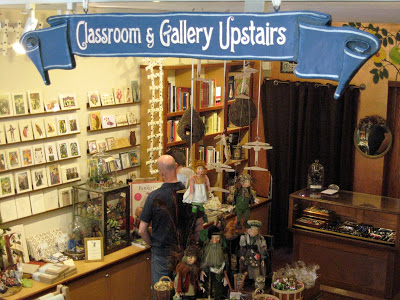
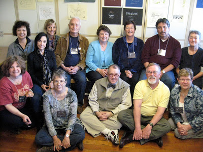
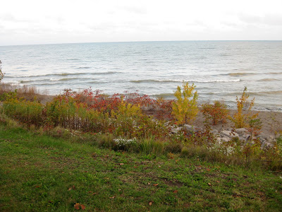
In April the Berkeley venue, Castle in the Air, is busy, lively, and very connected to the Fourth Street goings-on, with lots of great places to eat and shop during breaks from the pen and ink. Art seems to be in the very air there. And... just a twenty-minute drive across the Richmond bridge from my house!


Both experiences are awesome: the former rich with penmanship history and the latter showing Spencerian's relevance in a contemporary setting.

Bill's digital overhead projector enabled this kind of detail! Sure beat struggling to watch over someone's shoulder. This is a comparison of the Nikko G and EF Principal nibs...


At the top is my final project: My life has a superb cast, but I can't figure out the plot, a quote I love and neglected to attribute to Ashleigh Brilliant. The script is Spencerian, of course, in Dr. Ph. Martin's Bleedproof White with embellishments in Spectralite gold. I used an EF Principal for the text and a Nikko G for the offhand flourishing.

Castle in the Air has published all of our final projects on its blog. I was amazed at the variety and ingenuity as the participants--who ranged from first-timers to twenty-year veterans, hobbyists to seasoned professionals--showcased the variety of techniques we had learned during the week from . It was a fun and lively group!

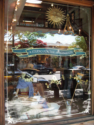
And the entire week we had the strangest feeling someone was watching us...


Copperplate Goes to Washington


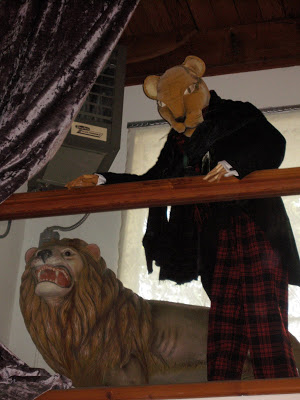
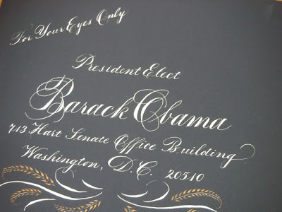
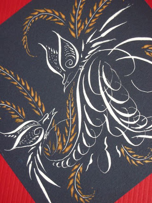
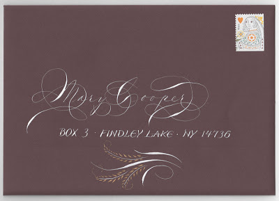
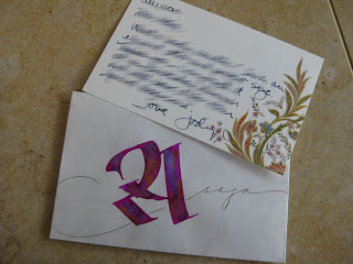
My storyteller friend Anita had a dream: to tell an African folk tale at the Presidential Inauguration in January of 2009. She had been a passionate campaigner for him, and she wanted to do everything she could to get Obama's attention to her proposal. So she asked me to address an envelope to him and do some offhand flourishing on the folder that contained a copy of the story.


I believe the envelope was actually a "Presidential blue" color, not black as it appears here. The script is Copperplate, or Engrossers' Script; the inks are Dr. Ph. Martin's Bleedproof White and Spectralite gold.


I did three different outer envelope styles and let her choose. This is the one that went to Washington...


...but alas, no response! But as Anita's grandma told her, "The only failure is not trying!"

End-of-an-Era Envelope


This was the last envelope I sent to a dear old family friend before she moved from her lakeside home of sixty-five years to a high-rise retirement community on Lake Erie---where, by all reports, she is having a blast. I can hardly imagine Findley Lake without her. I would see her during summers my family spent at the lake, and we corresponded regularly the rest of the year thoughout my childhood and beyond. She still writes me long, "newsy" letters, as she calls them, at least a couple of times a month, in hand-addressed envelopes, of course. I try to reciprocate in kind.

The script is, of course, Spencerian, and the blocky lettering is after a style (unnamed?) designed by the inimitable Michael Sull. The ink is Dr. Ph. Martin's Bleedproof White, with the cartouche detailed in Spectralite gold. And of course, the Queen of Hearts stamp is perfect.