Penwork Where You Find It

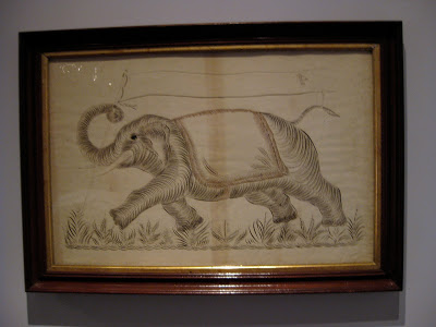
"Elephant with Banner", Anonymous
Colby College Museum of Art
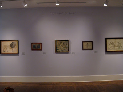
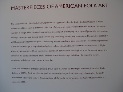
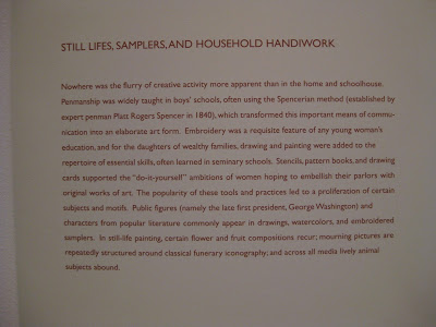
The first time I attended Parents' Weekend at Colby College in Maine, I made sure to visit their impressive art museum, one of the finest on any campus anywhere.  I was amazed and delighted to find several examples of penwork hanging proudly in their American Folk Art exhibit.


They even mentioned old Platt Rogers Spencer!  Pretty cool, I thought, since I had just come from the Spencerian Saga...


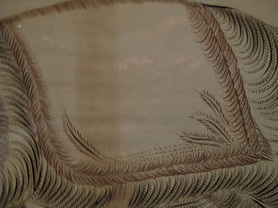
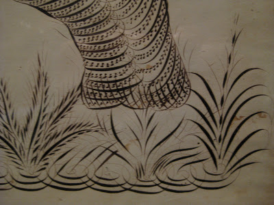
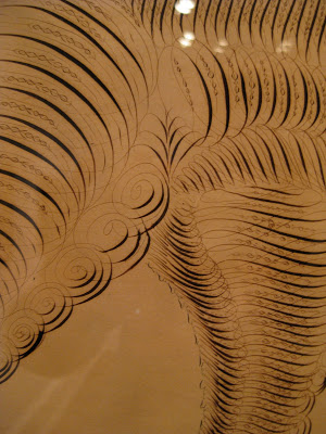
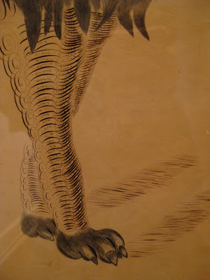
Some detail on that elephant:


Then there's the King of the Jungle:


"Lion", C.L. Horton
Colby College Museum of Art


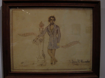
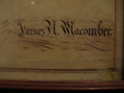
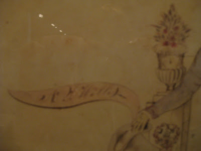
And finally, a memorial piece by James Macomber.  Apologies for the blurry photos....


"Mourning Picture of  N.L. Willis", James H. Macomber
Colby College Museum of Art
 The artist rendered his own name in Masterpiece Flourishing!


"Done with a steel pen"

A lovely visit all around!


The Saga Continues

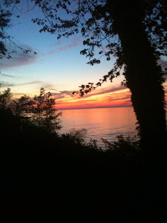
One of the highlights of October was my third visit to Geneva-on-the-Lake, Ohio for the Spencerian Saga.  The sunset over Lake Erie the first night could not have been more welcoming.


This year it was the Engrossers' Saga--a once-every-five-year occurrence--and the 25th anniversary of the annual workshop.  I've already said plenty about the Saga here, but this one seemed to bring together a lot of things I had been dabbling with and helped me see how I could put them to use in a cohesive piece.  Stay tuned for that one...

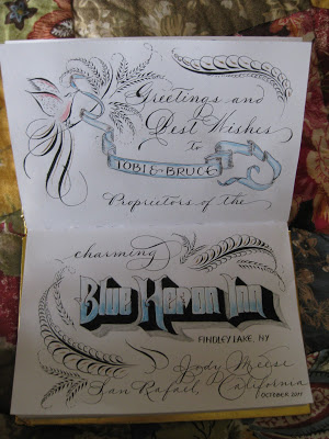
From Ohio I went to meet my sister at my beloved Findley Lake, New York, to stay at the Blue Heron Inn bed-and-breakfast...in the Lakeview Room, of course!


I decided to put some of my new-found skills to work as I signed the guestbook.  Maybe no one will ever see it, but I love knowing that it's there!


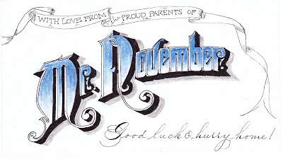
Back home, while messing around on the internet I discovered that my son had been named "Mr. November" at his college back East.  Not sure what that's all about, but used it to adorn the 3 X 5 card that will be enclosed with his exam-week care package:


Onward to December...!

More Calligraphed Confections: Marian's Cake


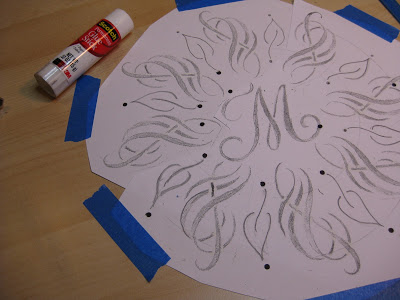
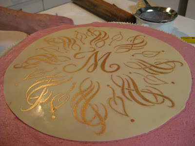
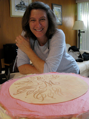
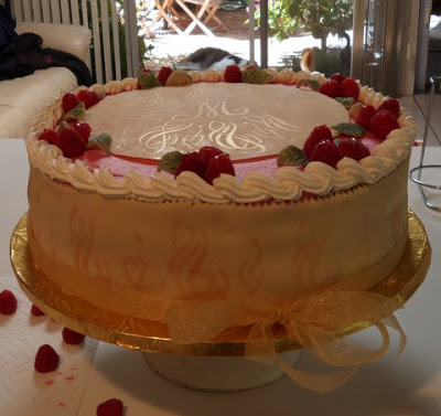
Wendy and I so much enjoyed making the "K" mandala cake that we decided to do it again, this time for my friend Marian,  a self-professed diva who is turning 75.  My idea was to work a stylized treble clef into the design because she is, after all, a soprano--but treble clefs are so, I don't know, ordinary.  There was a lot of trial and error involved, so I worked in pencil on this one.


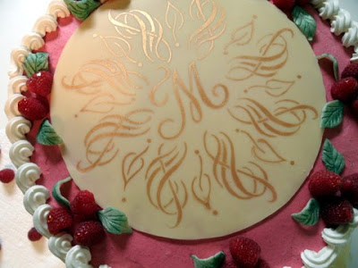
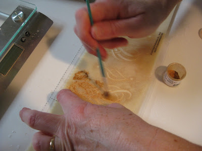
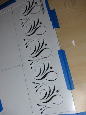
This time I cheated a little bit and when I finally got the motif right I just made seven copies and pasted it up.  I added the leaves freehand for some finer contrast.  The dots were punched from black paper and glued, making much better circles than I could have done by hand.  Again I taped the design to the table, placed a piece of glass over it and then the stencil blank over that.  With my handy "burner" tool I cut the stencil in no time at all.  Then I headed over to Wendy's to test it with "old gold" lustre dust on parchment paper.


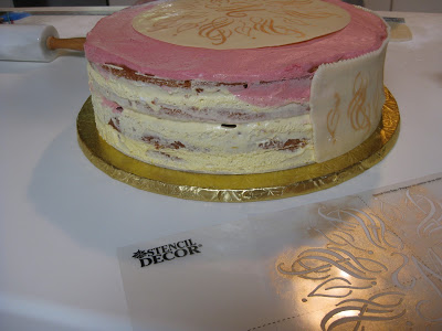
Wendy decided we should do the sides of the cake as well (a 14" creation!) and sent me home to make that stencil.  Again, I copied, cut and pasted using elements of the round top design.


By the time I got back to her house, she had applied the gold to the top of the cake, a perfect disk of white chocolate.


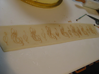
Just imagine:  layers of almond-flavored cake alternating with layers of raspberry mousse and lemon cloud illusion (lemon cream made with lemon curd).  To die for!  We stenciled the sides on two slabs of homemade marzipan (Wendy skinned the almonds herself!).  It was a more subtle look than on the white chocolate, probably because of the moisture element.


Here's the first half applied:


And here's the master pastry chef herself:


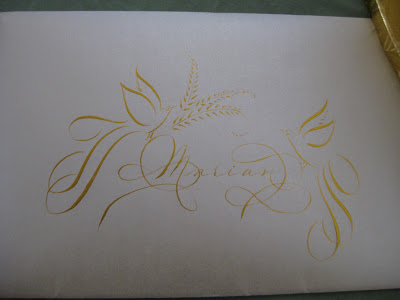
Back into my studio I set to work making a matching card for Marian with my trusty Zebra G nib in Aztec Gold Finetec on Opal Stardust cardstock and envelope.


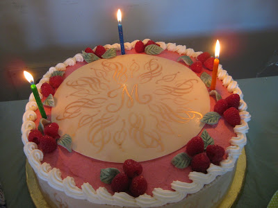
By the time I picked up the cake the next day for the party, Wendy had worked her magic with piping, fresh raspberries and marzipan leaves.


At the party, the beautiful birthday diva serenaded us with her amazing voice (and we serenaded her back with "Happy Birthday")...


...candles were added for "past, present and future"...


...and then it was time for cake!


Wendy and I are having so much fun with this collaboration!  Stay tuned for the letter "T"!
Let Them Eat Cake!: Karen's Cake


I had already asked my dear neighbor Wendy Remer, an amazing chocolatier, to make a cake for my friend's 50th birthday celebration.  Then we saw the latest issue of Martha Stewart Weddings...


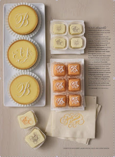
...and were inspired by the wonderful creations of Nan Deluca, Patricia Mumau, Dana Cochran, and Xandra Zamora. We decided to collaborate and create something unique for the occasion.

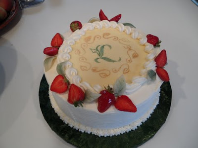
Having admired the work, and especially the mandalas, of Jane Farr, I was delighted to find her outstanding step-by-step instructions for creating them.  I penned my first mandala around the initial "K", then headed to Fedex Kinko's (or whatever it's called this week) to make a few enlargements.

With luck (and a 40% off coupon) I found an electric stencil cutter at Michaels--I didn't even know such a thing existed!  What a dream to work with!  It's kind of like a woodburning tool with a very fine tip.  It seems to work well on .003 and thicker acetate sheets, as well as the stencil blanks that are sold for this purpose.

I taped the design to my work table, then a piece of glass over that, and the blank stencil on top.  With a little practice I was able to keep the tool moving smoothly enough.  (I did have my husband improve the insulation, though--it gets very hot!).


The pieces popped out easily with a craft knife.


I set the stencil over a piece of black paper to make sure I hadn't missed any sections...


...and on a whim, took out my pan chalks and a cotton ball to give it a test run.


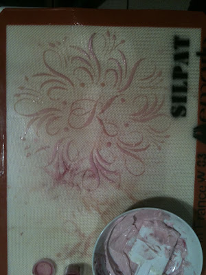
Then it was time to head over to Wendy's for further experimentation!  She had seen a video on using stencils with royal icing, which specified that the icing should be the consistency of mayonnaise.  She tried out the stencil on her Silpat mat with mayonnaise and pink food coloring.  Voila!


Encouraged by success, I cut and pasted elements of the mandala for a stencil to use on the sides of the cake.  We ended up not using it after all.


Though next time we'd make it a bit stiffer, the apricot-tinted royal icing was quite striking over the chocolate fondant, and Wendy added some touches of gold dust to dress it up a bit.  I made a little matching card to go with it (but forgot to take a picture of it).


The Birthday Girl was glowing and gorgeous!

Everything Old is New Again


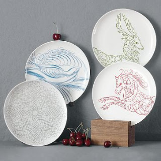
I was walking through West Elm on my way to somewhere else when I spotted these dishes and snapped some photos with my phone.  West Elm is a little too trendy for me, but if Offhand Flourishing is hip, I guess I'm cooler than I thought!  I haven't sleuthed it but the bird looks suspiciously like something out of E. A. Lupfer's  Ornate Pictorial Calligraphy.

The deer and the horse don't have the same graceful thicks and thins, but the idea is definitely there.


I didn't notice it in the store, but according to their website they also have a snowflake, mandala-like design:
 West Elm photo
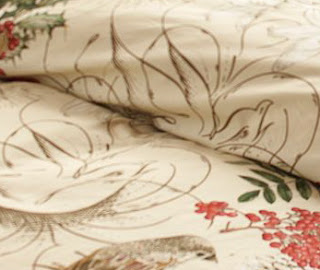
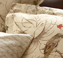
So I guess it should come as no surprise that Pottery Barn, which is also owned by Williams-Sonoma, has also used calligraphy in their holiday bedding design.

Pottery Barn photo
In this case the flourishings are relegated to the background, but I think they really make the design:

Pottery Barn photo
Pottery Barn photo
And for the truly obsessed dedicated, you can complement the ensemble with scribbly sheets!  Couldn't name the hand, but it looks to be French.

Pottery Barn photo
Pottery Barn photo
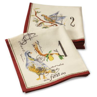
So I wondered if this was a running theme in the corporation, and headed to the Williams-Sonoma website.  Sure enough.  Napkins, tablecloths, mugs, glasses, plates, and even a cookie jar with calligraphy--some recognizably Spencerian--woven in.  We're taking over!

Williams-Sonoma photo


Disclaimer:  West Elm, Pottery Barn, and Williams-Sonoma have no idea who I am;  just thought these were fun and wanted to pass them along.


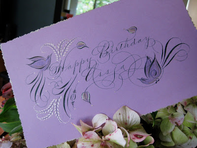
Having just finished a wedding envelope job with a lovely forest green ink, and envious of those who were able to attend some of the wonderful flourishing classes offered over the summer, I decided to try my hand and move into Autumn with a greeting for a fine colleague.  The ink is Bill Lilly's recipe of Pelikan 4001 with the addition of powdered gum arabic, brilliant green with a few drops of black.  Also some Spectralite nickel, Twinkling H2O copper, and pastel pencils.  So nice to be back in the studio!

West Coast Saga


The first-ever West Coast Spencerian Saga with master penmen Michael Sull and Bill Kemp concluded over two weeks ago, and I'm still digesting it all.

It was a completely different experience from the longstanding Geneva-on-the-Lake Sagas, which are retreat-like in nature, held at the beautiful Lakehouse Inn on the south shore of Lake Erie in October when the air is crisp and the leaves are turning. Platt Rogers Spencer himself lived, taught, and is buried in Geneva.

In April the Berkeley venue, Castle in the Air, is busy, lively, and very connected to the Fourth Street goings-on, with lots of great places to eat and shop during breaks from the pen and ink. Art seems to be in the very air there. And... just a twenty-minute drive across the Richmond bridge from my house!


Both experiences are awesome: the former rich with penmanship history and the latter showing Spencerian's relevance in a contemporary setting.

Bill's digital overhead projector enabled this kind of detail! Sure beat struggling to watch over someone's shoulder. This is a comparison of the Nikko G and EF Principal nibs...


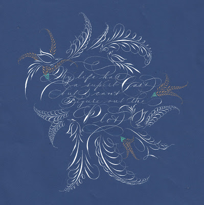
At the top is my final project: My life has a superb cast, but I can't figure out the plot, a quote I love and neglected to attribute to Ashleigh Brilliant. The script is Spencerian, of course, in Dr. Ph. Martin's Bleedproof White with embellishments in Spectralite gold. I used an EF Principal for the text and a Nikko G for the offhand flourishing.

Castle in the Air has published all of our final projects on its blog. I was amazed at the variety and ingenuity as the participants--who ranged from first-timers to twenty-year veterans, hobbyists to seasoned professionals--showcased the variety of techniques we had learned during the week from . It was a fun and lively group!

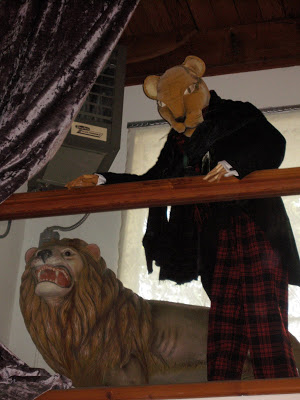
And the entire week we had the strangest feeling someone was watching us...


Copperplate Goes to Washington


My storyteller friend Anita had a dream: to tell an African folk tale at the Presidential Inauguration in January of 2009. She had been a passionate campaigner for him, and she wanted to do everything she could to get Obama's attention to her proposal. So she asked me to address an envelope to him and do some offhand flourishing on the folder that contained a copy of the story.
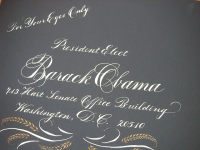
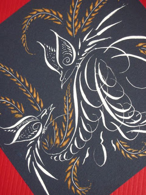

I believe the envelope was actually a "Presidential blue" color, not black as it appears here. The script is Copperplate, or Engrossers' Script; the inks are Dr. Ph. Martin's Bleedproof White and Spectralite gold.


I did three different outer envelope styles and let her choose. This is the one that went to Washington...


...but alas, no response! But as Anita's grandma told her, "The only failure is not trying!"