Letters of Note(s)


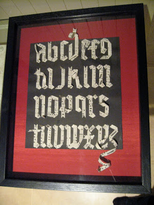
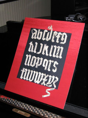
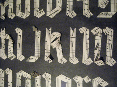
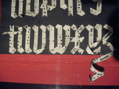
I was browsing through gothic exemplars one day and found a picture of a woodcarving where the letters looked as if they were made from ribbons.  I started wondering if that were possible.  Some antique sheet music pretty much jumped into my hand and let me cut it into strips, and then the fun began, twisting and folding and gluing.  I made the curls by winding the paper around a pencil for a few minutes, then tacking it in place. 


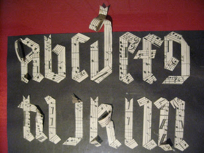
For me this piece was symbolic because right around that time I had decided to give up a longtime musical career, which had floundered for lack of enthusiasm, and pursue calligraphy as my artistic outlet.  I've never looked back!   (Thanks, Carole, for the photos!)


Walnut-Covered Chocolate

This was a homework piece for Ward Dunham & Linnea Lundquist's monthly "Black Sabbath" class at their wonderful studio, Atelier Gargoyle. The assignment was to write one word all in Gothic caps--something you'd probably never want to do in the real world. It was an exercise in spacing, and legibility be damned! Considering my choice of word, walnut ink was the obvious medium.

Bickham on Bamboo?


Look what I found yesterday in Columbine, a little local gift shop! It's a bamboo floor mat about 2' x 3' in size, made for indoor use. There's another design you can see here. Presumably the artwork is taken from the cover of a handwriting text (unfortunately the binding partially obscures the last word, "youth"), could be Bickham Sr. or Jr., (or any number of other penmen) and features pointed pen, Roman, and blackletter styles blended artfully and flourished beautifully. Perfect for my studio!

This Year's Runner-Up


Though I seem to be in a New Year's card groove, I've always loved this snippet of lyrics from "God Rest Ye Merry Gentlemen"--such a simple and universal wish. So when the November assignment at Ward Dunham & Linnea Lundquist's monthly Black Sabbath blackletter class at Atelier Gargoyle in San Francisco was to make a design with two or three seasonal words, I went back to this tried-and-true sentiment. To tie it all together, for the little words I took out my pointed pen and went for the ultimate contrast (blackletter--though in this case, whiteletter--and Spencerian), as Ward has encouraged me to do. ("Look to your Bickham," he says.) Guess I'll file this one away for a year when no inspiration strikes, or I break my shoulder again...