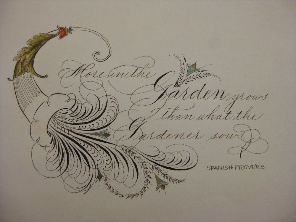
 |
| Gouache, colored pencil, gold leaf, Finetec on Bristol board |
Triple Threat

But I'm giving it one more shot this year! I've chosen three verses that are special to the children and known to the parents at the school, and illuminated the heck out of them. Gold leaf, crystals, Spectralite, Finetec, the works! I figure even if these babies don't go for much, I sure had a great time making them. Each is a little less than 5"x5", and I popped them into 8" x 8" frames.


Please hold a good thought that the KOD curse has lifted, and that these find good homes and raise some golden coins for the magical Mountain School!
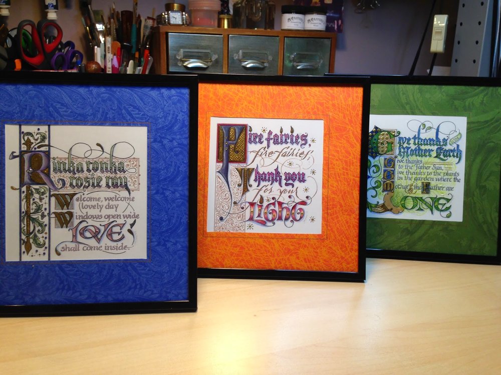
Update 3/29/15: There were bidding wars and these puppies raised well over $1K for the school! Yesss! The curse is lifted.
Update 5/15/15: Two families offered to match the top bids on their favorite piece, so now we're over $1900!
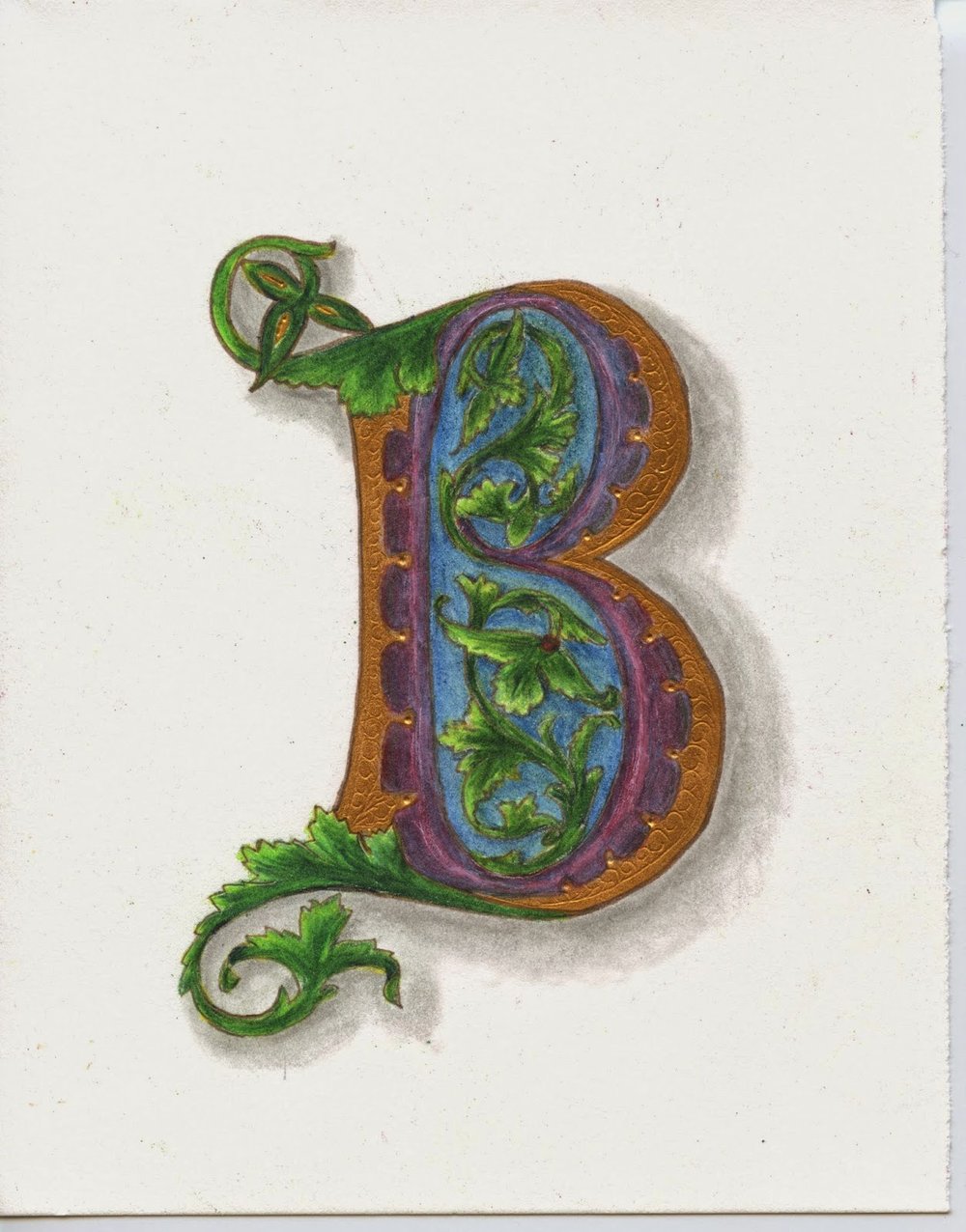
B is for...
 |
The (Second Half of the) Year in Pictures
 |
| Some of my designs for Ultimat Vodka Holiday Campaign |
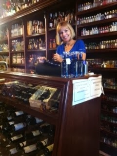 |
| One of five San Francisco venues for Ultimat events in November/December |
 |
| Very special commission |
 |
| Commission: walnut ink, watercolor and Finetec gold |
 |
| Zig Posterman pen on chalkboard fabric |
 |
| Chalk on display board |
 |
| Tooled gold leaf |
 |
| JJ Monogram, pen and ink |
 |
| JLM monogram, pen and ink |
 |
| CMS monogram, pencil sketch |
 |
| Gouache, gold leaf, ink on hotpress watercolor |
 |
| Piece done in Risa Gettler's Visigothic Versals class; ink, watercolor pencil, Finetec gold |
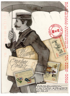
Envie Envy

The results are out and my amazingly talented friend Ruth Korch won Best in Show!!! No doubt you've seen some of her other winning envelopes online and on magazine covers, like this:
 |
| Ruth Korch |
 |
| Ruth Korch |
Ruth's, and the other winning envelopes will be posted here beginning August 8, and for those of you in the DC area, on display beginning in September in the lobby of the National Association of Letter Carriers building. Can't wait to see the fantastic array of creativity this event elicits! Congrats to all for postal awesomeness.
Sayonara Sylvia
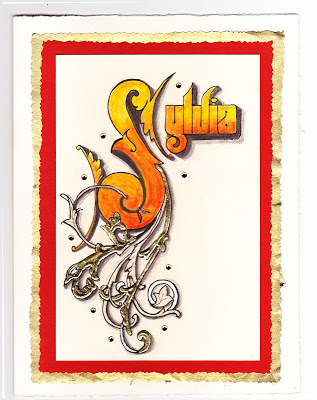
A longtime colleague is departing at the end of this week, and it is bittersweet for her as well as for those of us staying on. For some time, she has wanted to teach at the same school her children attend--which will significantly simplify her life, we hope--but she has been with us for many years and we all feel like family.
She loves orange, and wears it well. I wanted to make a going-away card for her that expresses both her favorite hue and the fire within her that makes her so strong and ambitious! Inktense pencils, lightly brushed with water, give a flame-like feeling. For the ornamentation, I remembered learning from Harvest Crittenden how lovely it is to combine gold leaf and shell gold (see the halo in this post); this is the "poor man's version" with gold leaf over Instacoll, and painted Finetec gold and silver. I love the dimensional look it gives!
The shadows on the Sickels lettering are Zig gray suede (a heretofore under-appreciated brush pen that has patiently awaited attention in my studio) and HB graphite; outlining is done with a fine-tip Pitt pen. The paper is Crane's correspondence card, mounted on a piece of old greeting card (cut with deckle scissors), a piece of metallic gold (ditto), and a Fabriano Medioevalis card. The final touch was a scattering of random crystals from Michaels, glued on. Hope she likes it!